Highest rated logos
Highest rated logos – Page 57
New logo for Webkolm web-agency. Webkolm is an Italian Web Agency based in Trentino. They develop website and other web stuff "into the wild". The agency is formed by three people: an UX Designer a Crazy Programmer and an Social Media Manager & SEO Specialist. Three different mind with different skills one identity. The old logo rapresent a "UI arrow" shaped like pine. The new logo mantain this elements but in a modern way thank to the "Impossible triangle structure" ispired to Escher works. The font is "The Sans" with a semi-serif that caracterize the K word.


Power sources - logo for the psychologist who's main focus is sources of woman strength.

Personal work

Logo created for a guitar builder.


Brand for any kind of studio with a lot of creativity. A funny way to approach the job.
Logo para triciclo infantil (de brinquedo) Logo for children's tricycle (toy)
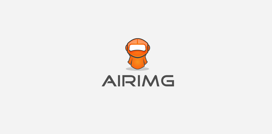
this logo for tech company called "airimg" , I created a modern robot mascot as spokesperson to represents airimg with with bright colors .
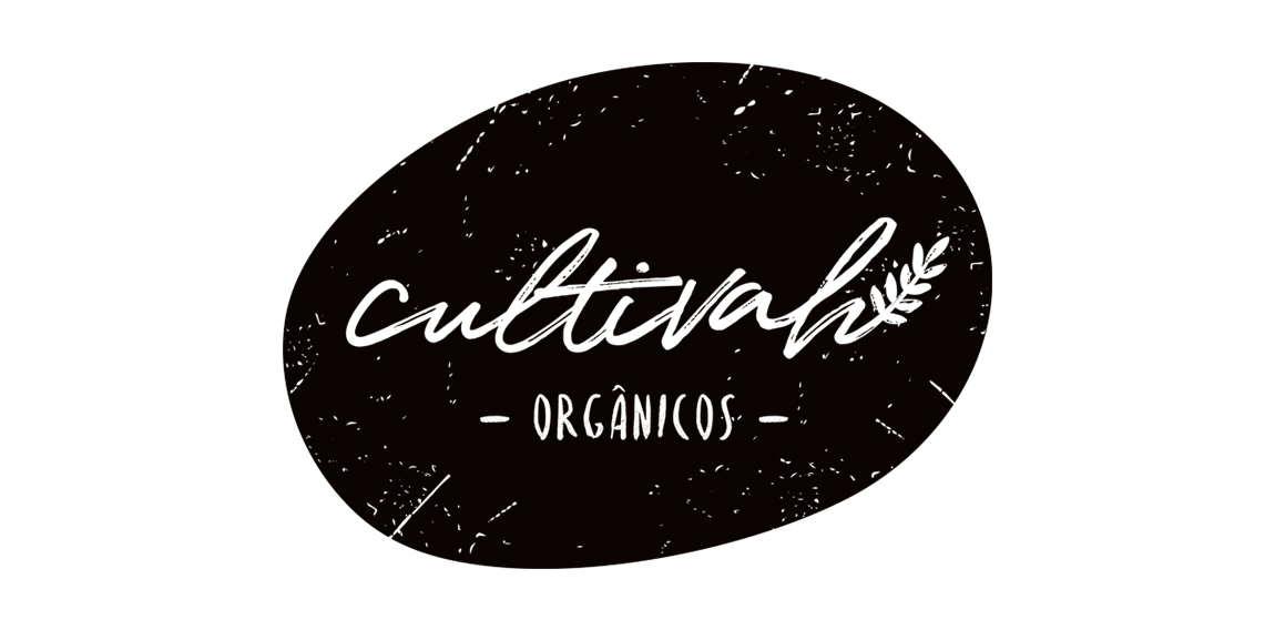
The lettering constructed irregularly, as if it had been drawn by hand, expresses the organic aesthetics of Cultivah. The branch, which extends throughout the lettering, as if it had germinated, contemplates the main product of the company, the one of vegetal origin. Finally, the noises present throughout the brand, its imperfections, illustrate the in natura language of business, free from external agents and conceived in its purest form.
Hedge Fund Logo

logo for a consultancy, meaning a part of the network, as well the logo is having some free mason symbols

My personal brand.

Logo concept for an online store selling Christmas decorations.
Logo for winery.

free mail service

Logo for downtown bistro.

Tea company logo.

Unused mark for a online dog supplies company.
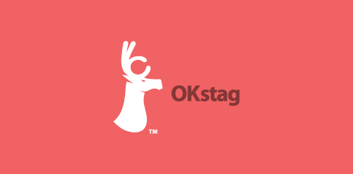
A stag with it's horns shaped as an "OK" sign

Logo for a russian food restaurant serving only one dish from the soviet union period. Client requested that a symbol from the soviet union will be integrated/present in the logo mark.

Logo developed for a business consultancy. The logomark represents both searchlight and strategies.

The company rents apartments at Baltic Sea.
Brand Identity for an events management company

ASTI provides skill training for Indian workers who work for international businesses.