
Highest rated logos
Highest rated logos · Page 55
Hospital


COMBOX is fresh modern dynamic brand with short easy memorable name. It will suite well to any business or industry.

House creativity
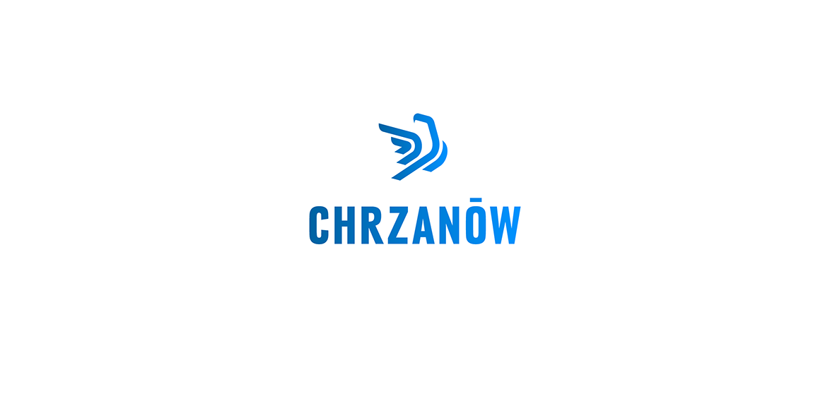
Logo proposal for a town named Chrzanow. The sign is a simplified presentation of an eagle which is most recognizable sculpture on the main square in the town.

Invisible technology!

CST is a training company. Symbolism of a chess knight is central to CSTs strategy. It exemplifies dynamism and initiative. Basing on these qualities and the target group in part the automotive branch I have referred in the lettering and composition to the aesthetics of sport cars emblems. Over the course of many sketches, I have created a convincing, minimalistic silhouette. Rendered as negative space against a chess square, it creates a bold, cohesive and legible mark.
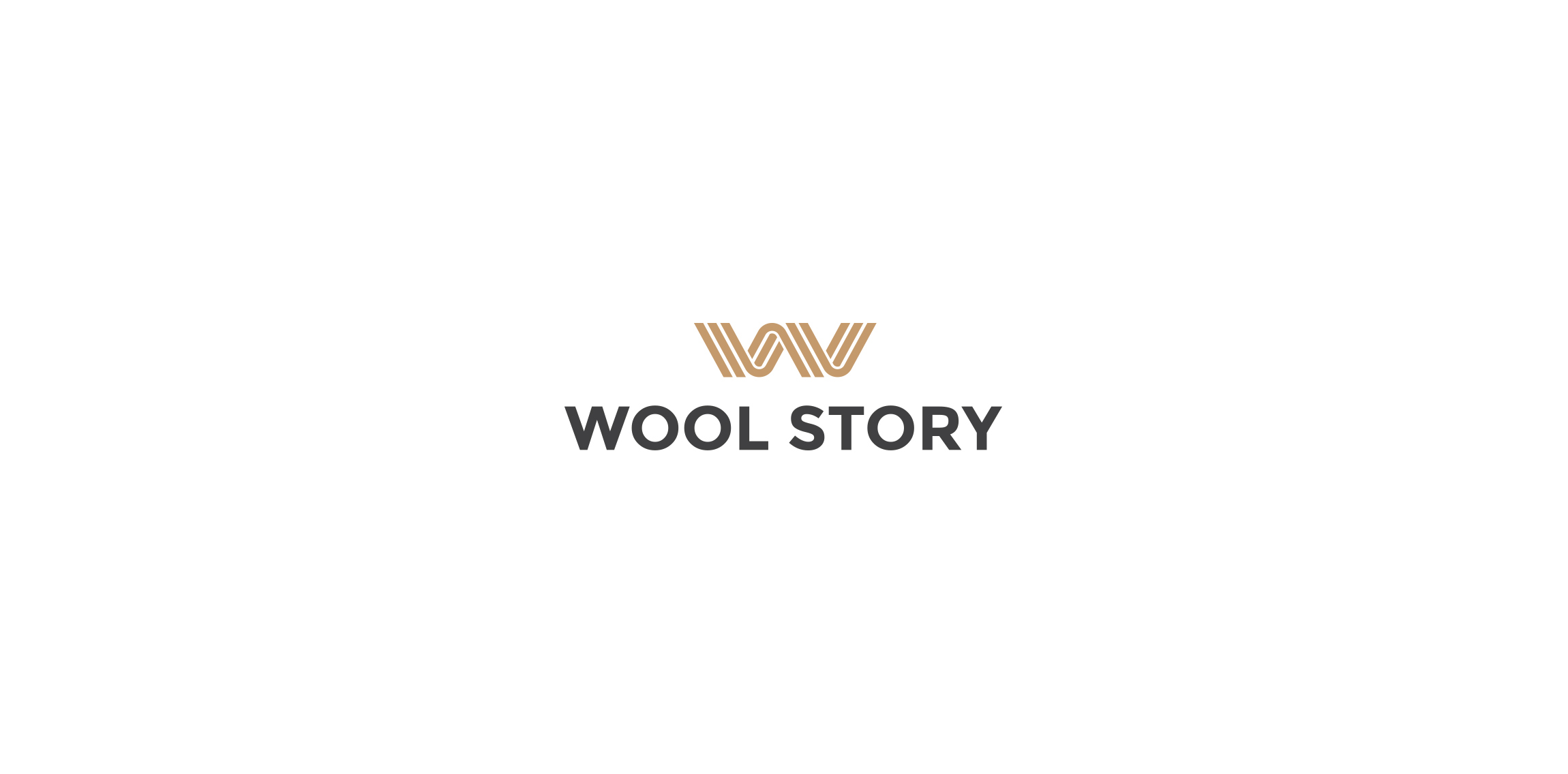
Polish company offering high quality, handmade wool products.

Logo concept for an online store selling Christmas decorations.
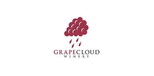
Logo for winery.

free mail service
Some experiment about verbicon, i hope you like :)

Logo for app development company. Naia means dolphin in hawaiian, but client wanted ocean symbolism (wave) in simple and modern way. Abstract, geometric wave shape. Overall look is minimalistic, modern and distinctive.

Logo created for an audiology office in San Antonio, Texas. The shape of the logo represents sound waves.
horse trainer
Logo design for a funding project in South Sudan.
A stag with it's horns shaped as an "OK" sign

Logo for a russian food restaurant serving only one dish from the soviet union period. Client requested that a symbol from the soviet union will be integrated/present in the logo mark.
simple logo designs lovelive

The company rents apartments at Baltic Sea.

tourism
Simple and modern logo.


Swan (24)