Cultivah
Cultivah
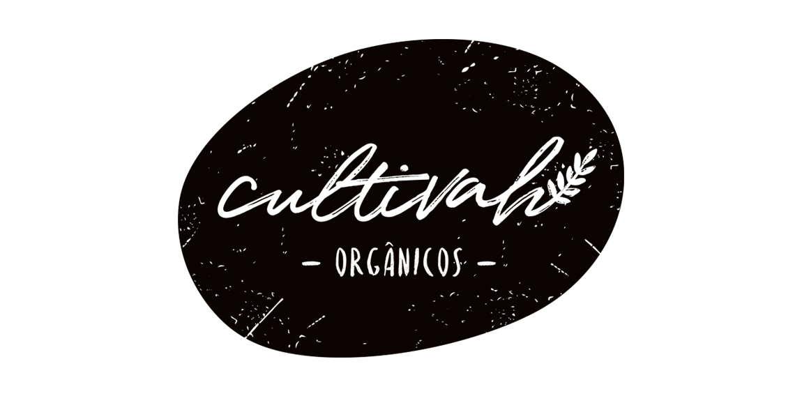


- The lettering constructed irregularly, as if it had been drawn by hand, expresses the organic aesthetics of Cultivah.
The branch, which extends throughout the lettering, as if it had germinated, contemplates the main product of the company, the one of vegetal origin.
Finally, the noises present throughout the brand, its imperfections, illustrate the in natura language of business, free from external agents and conceived in its purest form.
 Designer: HeadMade
 - Submitted: 06/13/2017 • Featured: 07/09/2017
- Stats: This logo design has 5073 views and is 1 times added to someone's favorites. It has 1 votes with an average of 4.00 out of 5.
Designer