
HeadMade
HeadMade was launched in mid-2016 to provide strategies and new experiences through design.
As its name implies, our solutions are "thought and created with the head", and allied to our feeling and creativity, result in projects that meet the needs of the client and the Market.
We believe that design is the tool capable of transforming a business, making it more competitive, and strengthening its value to the consumer.
With more than ten years of experience in the segment, we have works that have been featured in specialized design websites with worldwide audience, using our expertise to develop solutions in visual identity, branding and packaging.
 Joined March 2017
 9 logos
 https://headmadedc.wixsite.com/design

The logo has the concept of joining the letter H with the hexagon. This union of the two elements occurs in a fluid and joint way, making both a symbol only. The graphical effects used give the symbol depth and dimension. For lettering, an easy-to-read format was designed , which refers to the technology area. Details in each letter and adjustments give the feeling of agility and exclusivity to the name of the company.


Da Vinci, a gelateria located in Alberta - Canada, produces handmade gelato, inspired by the best products made in Germany and Italy. The company, founded in 2015, needed a new visual identity, which expressed the added value and refinement of its products. Thus, HeadMade was in charge of developing the new brand of gelateria, and thus repositioning it in its market.
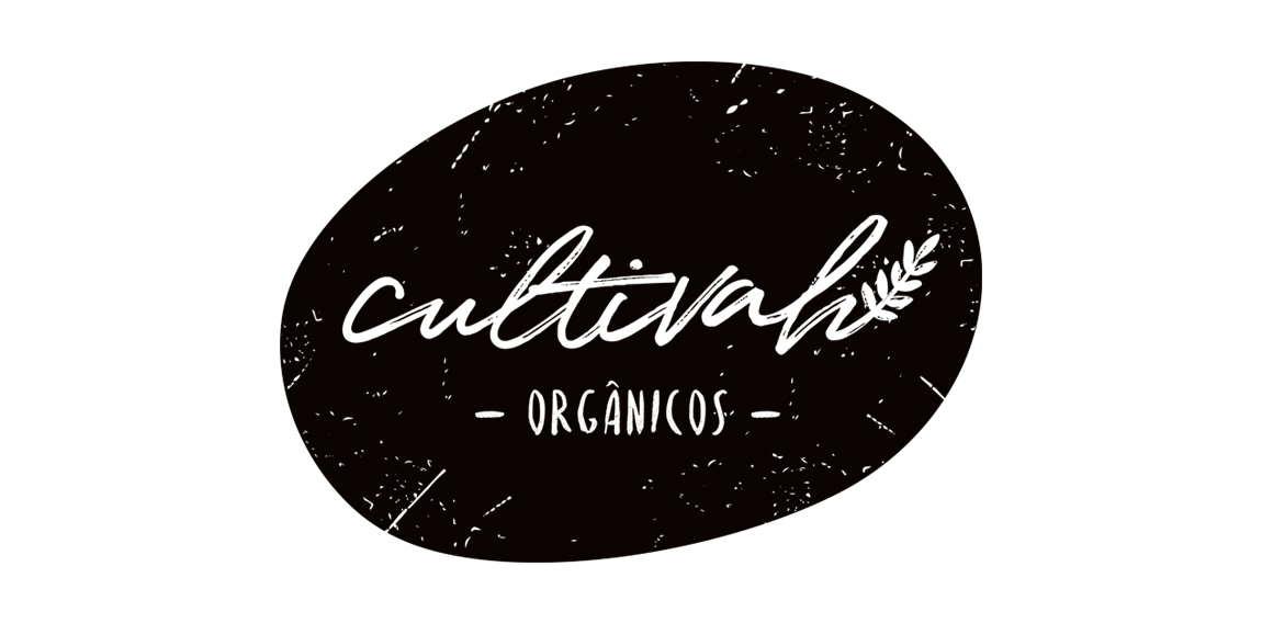
The lettering constructed irregularly, as if it had been drawn by hand, expresses the organic aesthetics of Cultivah. The branch, which extends throughout the lettering, as if it had germinated, contemplates the main product of the company, the one of vegetal origin. Finally, the noises present throughout the brand, its imperfections, illustrate the in natura language of business, free from external agents and conceived in its purest form.

The symbol representing a crown, refers to something noble, reflecting the quality of the work, as well as referring to the crown of Santa Maria, since the main public served is the Catholic church.

The project had as its starting point to convey the essence of the service offered. For this, they were considered as pillars of the concept, the reception, the human relation and the trust. The brand, built from the initials of the name of the professional, form a mandala that in addition to refer to energy and reflection, create a link with the patient.
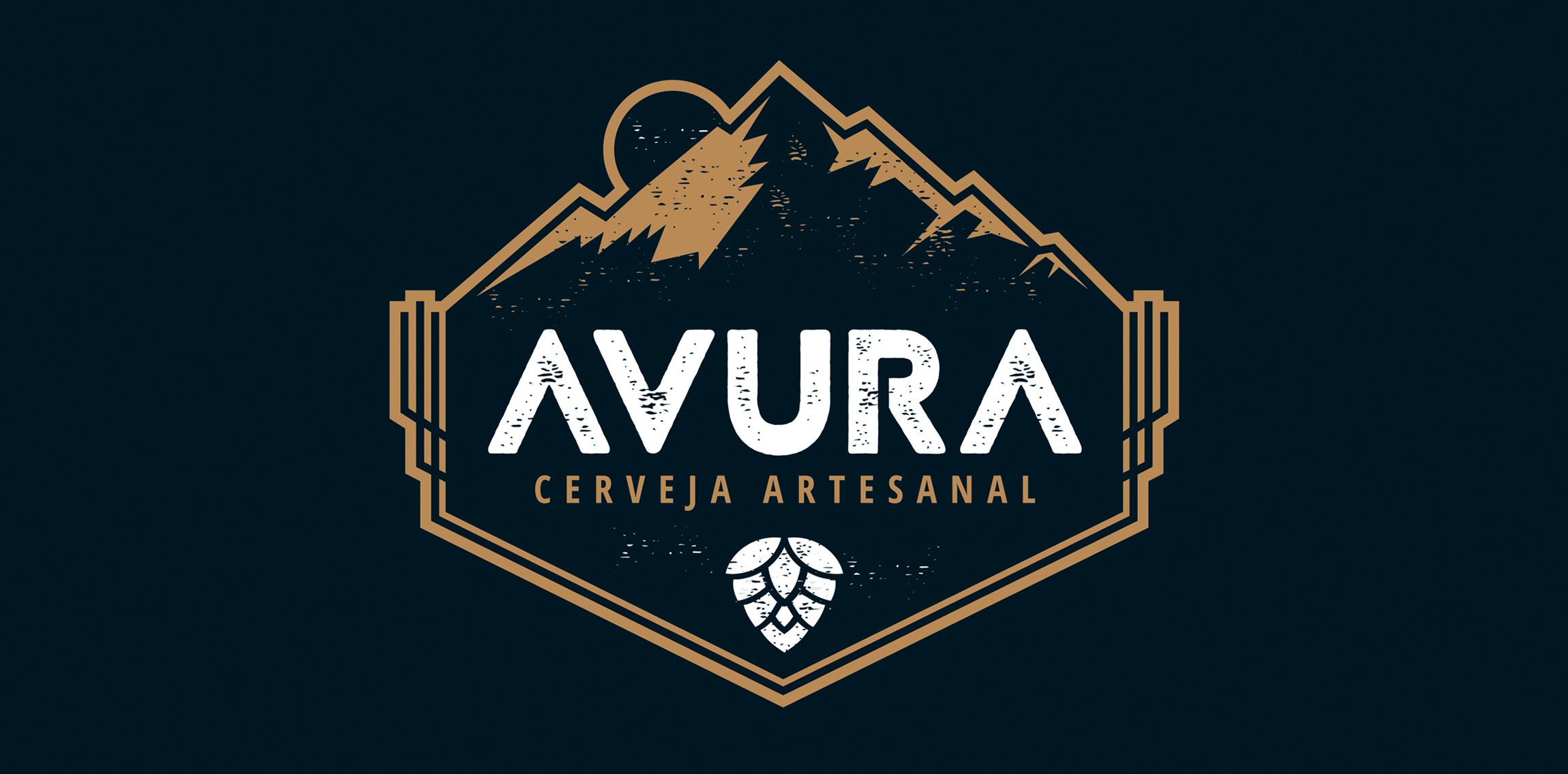
The artisanal beer developed by Avura - Minas Gerais - received new look through the brand developed.
With rustic typography and having the mountain range as a symbol, refer to the geography and regional aspects from where the product is.

The visual identity project developed for the company specialized in Tenders & Distribution, in Florianópolis - Brazil, aimed to reinforce the concepts of excellence and trust, pertinent to the business. With the use of an exclusive typography and a symbol with a modern design, consisting of a continuous line, referring to its broad and solid performance, the company is moving towards its goal of obtaining national prominence.
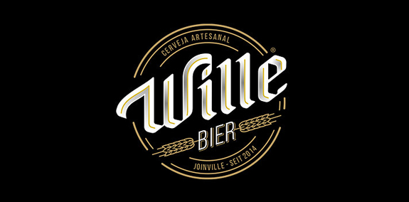
In 2014, Wille Bier was founded in SC/Brazil by two beer lovers, with the aim of developing a handmade product quality and exclusive. The visual design retains the traditional features present in that business, but brings language to the current scenario, allowing the product to talk to different types of consumers.