Highest rated logos
Highest rated logos – Page 47
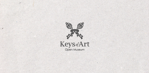
In the designer's words: An elegant logo infused with meaning. Functional both in the color version and in the version in black and white. Designed for galleries and museums open to all forms of art / Ideal for these industries: Art & Photography, Events, Design & Creative Services.


Logo for a dental clinic

As a new media relations agency specialized in TV and radio, Médiatiser.tv has a very peculiar approach: rigorous, but nevertheless really fun! Brand Brothers played with this approach and created the visual identity of the agency and a graphic universe around a lovable mascot: a crazy, television-headed octopus ... which comes to life online!

company logo to harnessing wind resources

Logo design for Phoenix Textile Products who are based in Dublin.
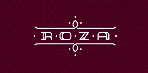
Logo for little pension in Poland mountains. ROZA comes from the first name of owner RÓŻA which mean in english ROSE. Custom typography.

Designer: Denis Aristov Client: KS-Stroy Industry: Housing Estate Keywords: a tasteful housing estate, housing, estate, development, victoria, V, initials, pinestrawberry, red
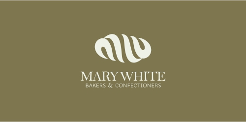
Logo for a bakery

Idea for specialist maritime law firm

When you see, you act, so seeing is acting - a path to radical transformation. The Eye in Hand symbol is a multi-cultural expression of the interactive bond between two essential human functions: 1) Eye: sensing, knowledge, observation, omniscience (all-knowing), and 2) Hand: doing, power, acting, omnipotence (all-powerful). "It is only when you see the conditioning and the danger of it immediately, and as you see a precipice, that you act. So seeing is acting."
Logo for a hotel or a local business
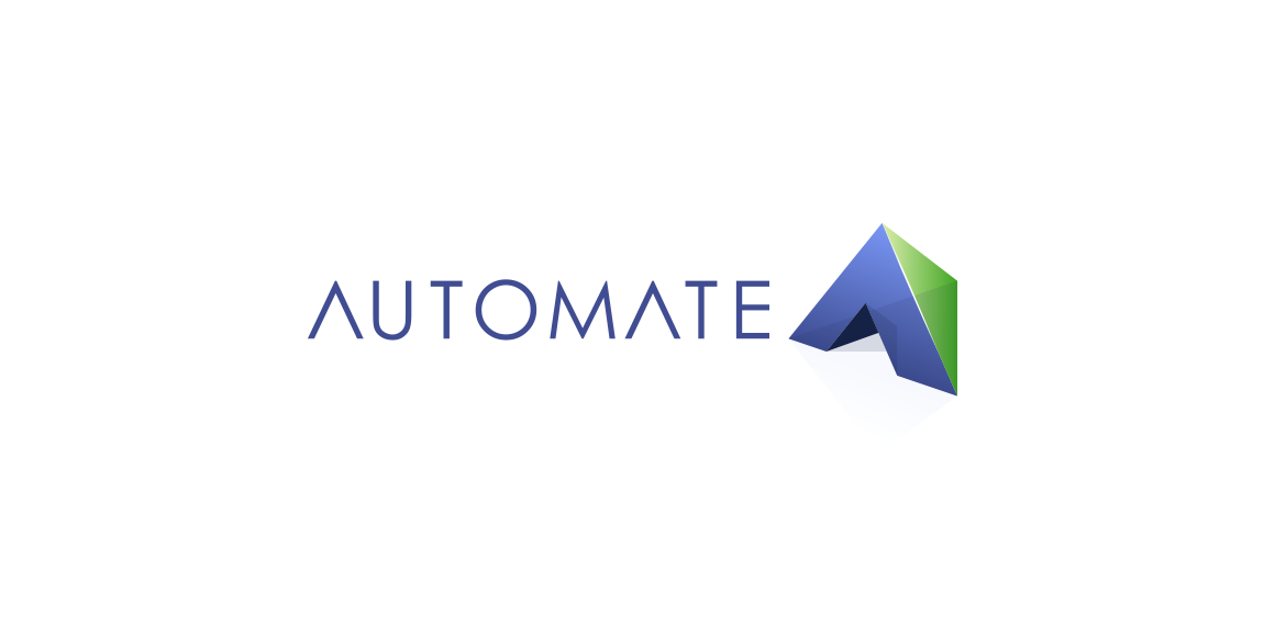
Autoamte: Automation as a Service A company engaged in the automation of technological processes.

Fish Club logo

Space cafe

Like us on facebook: www.facebook.com/hunapstudio

Logo developed for a business consultancy. The logomark represents both searchlight and strategies.
logo for a coffee shop based in mexico.

I was challenging my self on how to illustrate 3 gears intersecting each other...this took me a lot of time to complete. I am happy with the output (humbly) This is now for sale on BrandStack
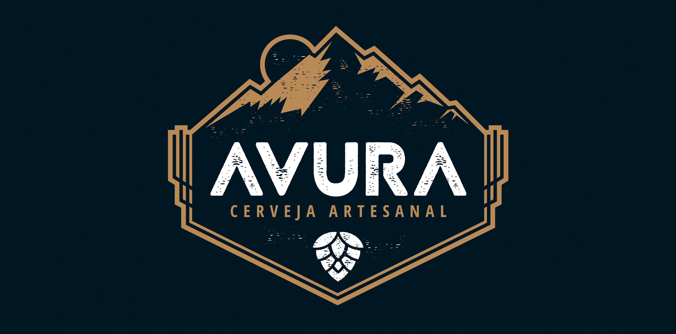
The artisanal beer developed by Avura - Minas Gerais - received new look through the brand developed.
With rustic typography and having the mountain range as a symbol, refer to the geography and regional aspects from where the product is.
Unused idea for a shopping centre
This logo was created as a personal brand mark for Geoff, to represent him as a graphic artist. This typographical solution was inspired by the 17th century Romaine du Roi, which features a serif face with its underlying structure. This mark was used previous to the Geoff Matheson Studio "G splat" and is no longer in use.

Xperity is a Dutch agency specializing in Microsoft Dynamics 365 and CRM for businesses.

Logo for clothing company.
The letter 'X' + Heart (Symbol) Get More Info: http://drbl.in/otZM