Highest rated logos
Highest rated logos – Page 408


KOOL DOWNLOADS

This was a logo design for a National Park in Canada.
Event Management Logo
T4ti is a tech company created by 3 young entrepreneurs. Their main product is a high tech jacket that syncs through wireless with smartphones the user is carrying.

Urban Jungle developed a corporate identity system inspired by the Venn diagram that defined their customer experience. The design system is clean and crisp, which helps to position the firm as stable and intelligent while maintaining the allure of their quiet confidence and professionalism.

Logo for a Martini Bar at a local resort. I won an Addy award for this one.
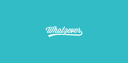
whatzever logo

Genoveva is a new Potrugese Graphic design studio
Did this for a submission - Its for a donation drive. The curves/flourishment around the words represented hands - which means extending our hand to help the needy people with a sincere heart and of course with a smile too. Within the logo there is a heart and a smile see if you guys can spot it! Any comments on how to improve is also welcome! Appreciated it!.
Design & Advertising Studio

Big Slice is a wood fired pizza place with a traditional brick oven. The custom-made hand lettering is a tribute to old style american lettering for restaurants.
This logo is based on basic symbol using for dogs & cats, this company is seller of any dogs and cats food.

BPO for shipping companies A propeller was used because of it’s importance for the progression of a ship. Similarly Diabos helps shipping companies move forward. The blue was derived from the sea

Logo for photography services...

http://rastasoft.ir/
This logo represents a brand of culinary products that are custom made for restaurants and other food service industries.
A new logo for a mountain site-seeing agency