
Highest rated logos
Highest rated logos · Page 339

3D Architecture Visualization company


second concept for muh!caffe | GERMANY | 2012
Campers for a cause

Logo design for a law firm company.

Logo design for power grid company.
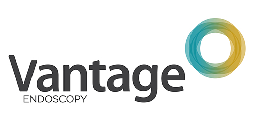
Inspired by the Spirograph, Urban Jungle designed the identity using a combination of four semi-transparent aqua and ochre circles. The circles symbolize the convergence of two unique corporate entities into one new corporate brand identity — Vantage. Using charcoal for the typeface, the identity blends a vibrant colour palette giving it a fresh, smart and energetic feel, and reflects the youthful and contemporary edge of the company.
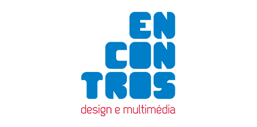
[see more in behance @ http://bit.ly/W8GJLS] Encontros Design e Multimédia is an event. It has being taken place since 2009 and consists in a week dedicated to promote and develop design and multimedia activities, workshops and meetings in the city of Braga. It's promoted by Escola Profissional de Braga. The design, organisation and communication of the event is the responsibility of a finalist student. [The brief] Encontros Design e Multimédia had a clear ambition, grow year after year, it wanted to inspire, involve and thrill the students, professionals and enthusiasts about Design and Multimedia. The logo was to be used in the website, facebook, promotional material, including posters, flyers, video, and a lot more. The goal couldn't be clearer, it had to be unusual. [The solution] The logo represents Encontros's strong ambition. It has all the elements to succeed, it's simple, relevant, it incorporates tradition, it's distinct, memorable, versatile and it stands out from the crowd. It's designed to be filled. Filled with photos, images, participants, speakers, filled with design and multimedia. It has no icons of design or multimedia and doesn't need them, it has all the qualities of both and all the creativity to be anything. [Typography] Encontros has a unique typeface, its custom and it's designed specifically for this brand. It's a bold geometric typeface designed to be filled and to get noticed in every contexts. [Colors] The colors are one of the most important elements of Encontros. The chromatic scheme is very expressive, it's a variation of the well known CMYK, providing a vast number of combinations making the brand very dynamic and inspiring as well. [see more in behance @ http://bit.ly/W8GJLS] [joserodrigues @ http://be.net/joserodrigues]
The hand holding the money

Q3 Marine Training Solutions

NEARQ

Sullivan Restaurant Group is a restaurant consulting and management firm in Denver, CO

A concept made for a contest. A new brand of flakes. Taste which takes you to the stars ;)

Audit specializes in implantable hearing solutions.

Wear Company - Sofia
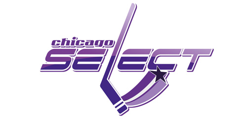
Unused proposition in contest for chicago hockey team

a logo made for my own project - custom type.

A logo for a wedding planners

GREEN POWER is fresh modern dynamic brand with short easy memorable name. It will suite well to any business or industry.

Nonn's has been in business for thirty years, we updated to a more upscale image to show the diversity with the brand and interior design service. The icon works together or separate.

logo for a professional company in home and living equipment

Company stores for supplies gifts and souvenirs, aims to provide the best solutions to choose a gift appropriate for different occasions .. is seeking to achieve satisfaction to all its customers through its services in helping them to find the gift meaningful, large property that memorable.
