
Highest rated logos
Highest rated logos · Page 341

a logo made for a portal with info, documents and tips on interviewing both for interviewers and interviewed.


WEJ

The concept convey a worker silhouette and a basketball ball.


The logo depicts a cat of breed Sphynx. The logo is designed for various areas of business, in particular for kennel of the cats.
environmental advice and projects

A logo for a cuban salsa club called Buena Vista Club Zagreb


O R A N G E


Logo for Transfer skateshop/boardshop

DK

Logo concept for new business.

Logo design for "FITTLE" - fittle.me This logo idea presents dual meaning - HEART and CHECK MARK symbol. The logo presents the joy of healthy achievements and exciting lifestyle. "FITTLE" aims to bring together health professionals and clients from around Australia.
TV, sound and print production firm
Logo for my art & design studio.
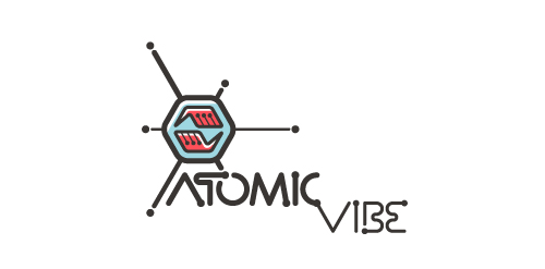
I define ATOMICvibe as the "a-HA!" moment of clarity in the creative process. Like nuclear fusion, it's when tiny ideas coalesce, and then explode into beautiful design.
The logo visually depicts this creative reaction. Forming abstract A & V shapes, the converging hands cradle the tiny beginnings of a big idea, fusing them until they discharge a shockwave of creativity. The custom type, designed to perfectly integrate with the mark, is meant to symbolize electron paths. Heavily inspired by retro imagery from the Atomic Age: science, the Space Race, Sputnik, the iconic George Nelson Ball Clock.
Click here to see the case study for this logo, which chronicles its development, and includes full design rationale, sketches, electronic roughs, and alternate designs.

Second version logo made for an Q&A website dedicated to women.

Conceptual logo design showing a shield in the form of a bull head. For sale.
A new logo for the medical massage practice in Switzerland. A practice which is spezialized in classic massage, heat therapy and trigger point massage.

Logo for keratin studio..

maintenance of elevators

Logo of the game site.

Logo PAVA. site - http://ekran.in.ua/

VZLETS is specialized on Internet promotion and Social Media Marketing. See more: http://logomachine.net/