
Highest rated logos
Highest rated logos · Page 340
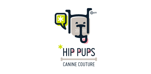
This fictitious company logo is the result of happenstance typographic exploration. I was playing around with H and I letterforms set in Platelet, and, after placing the I within the H, I noticed that it started to look like a dog face. After some modification, and with the addition of a curved P for an extended dog tongue, the resulting typographic illustration spelled "HIP." I thought it would be fun to name this fictitious company Hip Pups, which could be a shop that sells high-end dog accessories. The Registered symbol is integrated creatively into the mark by spelling "RUFF!"


Nine co., Ltd. operates flower shop, nail salon, dining, care services and various businesses.

Done for fun


"Iguaçu is the second biggest distributor of optical product of the South of Brasil and they were searching for the repositioning of their brand. We worked with a new communication aiming at the values of the company, which is about commitment and responsability.”

Touristic promotion of Lake Maggiore and Lake of Como (Italy)

The company provides electrical and electromechanical services

Poultry farm chicken COMPANY.
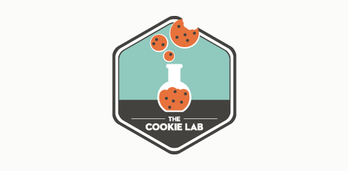
Logo design for the Boston-based bakery specializing in nerd-chic cookies.

Logotipo para una agencia de publicidad, el logotipo expresa de manera gráfica el concepto del alter ego, potenciado por medio del color. y hacer valer la promesa de la agencia a las marcas y productos de sus clientes.

CorsoRoma attends to networks and to all that, through networks, may be imagined, organized and developed.

Logo for design studio.

Logo for a dating website.

daily feed personal blog
This logo depicts a box without a top. It's symbolic of the ineffectiveness of services offered to homeless across the USA.

Dumma Branding is the design house of Duminda Perera. Duminda is currently involved in an ongoing logo project for design every day one Original, Clever, Wordmark/Verbicons or Negative logo.

This concept is based around a simple typographical focus on the RSSA acronym. The Society’s diverse scientific interests helped to form this visual approach, ie deliberately avoiding reference to any particular field with a recognisable visual. The intention was to provide a current day sensibility regarding identity design and construction, in combination with more traditional styling for a long established scientific body. To aid this desire, a modern serif was chosen as the primary font and a secondary sans serif for the tagline versions. These fonts were chosen as a combination for their ability to convey this future/past feel. The icon structure has the added effect of allowing the reading of ‘RS’ & ‘SA’ in either direction, and utilises the Society’s formation date within the design, as it adds historical weight and relevance, plus is also a small visual indicator regarding who and what the RSSA represents.

Another logo design for Eylart Company.
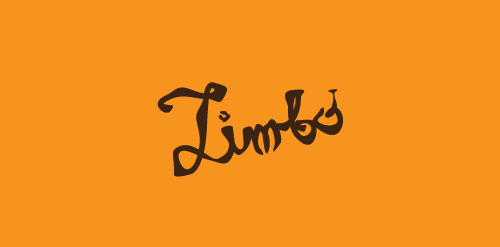
LIMBO is fresh modern dynamic brand with short easy memorable name. It will suite well to any business or industry.
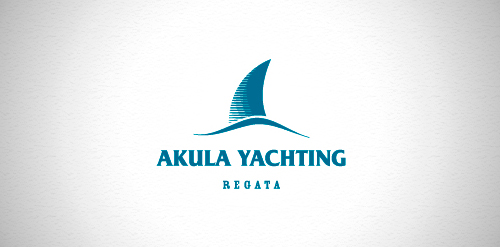
Designer: Denis aristov Client: Sailing Federation of Perm Region Industry: Sport Keywords: regatta, sport, yacht, wave, shark, dorsal fin, sailer, blue
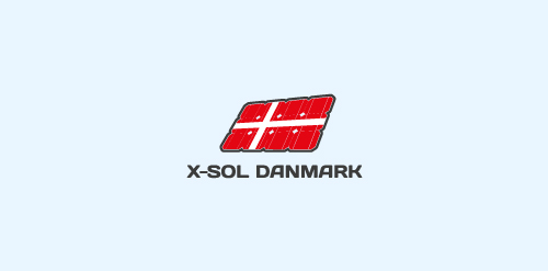
another concept for a dutch company which installs solar panels.
Munnes logo In order to highlight the quality, style and distinctive character of the Munne glasses, we have developed a logo that reflects all of this. He chose a stylish combination of an icon and a name. Using graphic details, we have created a unique and exclusive design of the character - the letter "M". The square contains a hollow letter, which consists of various graphic details and shapes. This style looks like a non-banal, unobtrusive, and eye-catching one. To keep pace with classics and aesthetics, we selected a combination of two colors, a white-and-white. It helps maintain the image of a neat, modern logo. We branded the brand next to the symbol. We chose the color of this dark brown, color. The brighter and "heavier" name of the brand has become like a counterweight, a dimmer symbol, while preserving the integrity of the style.
