Highest rated logos
Highest rated logos – Page 239
PROJECT Panax Pharma is Czech based distributor of medicines and pharmaceuticals. I was asked to create simple and distinctive visual identity including logo manual and stationery. CONCEPT The logo contains stylized illustration of medicine mortar - traditional tool used for pharmaceuticals production and processing. The mark is reflecting susceptible and responsive approach of company through subtle rounded stylization and refined execution of it's design. Negative space used in illustration of the mortar also inspires emotions of preservation and processing content from out. Finally Optima typeface with turquoise and silver color palette completes company corporate identity design basics.


Logo for Gubee service. See more: http://logomachine.net/


Logo for a construction company from Sweden.


Logo design for a non-profit children's art, culture, tutoring and mentoring program. 2011.

Another logo for horse
Logo design for a online fashion store company, U.S.A.

negative space utilised


Cosmetology Salon. Only logged in cosmetology foreign companies.


for fashion industry
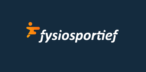
Logo design for a Dutch sport physiotherapy company called 'fysiosportief'. They asked me to come up with a new refreshing logo for their business. The client preferred the type to be custom and as friendly looking, easy to read and a little twist integrated in it that shows some sort of speed and dynamic. The icon is a combination with the letter 'F' together with a running human. Also tried to perfect the balance by adding that same shadow effect from the typo.

H designed using two hands
Organic and mineral cosmetics.
Woman butterfly logo for femine online portal called WOMAN!

Logo for WirtualneSchronisko.pl