
Highest rated logos
Highest rated logos · Page 218


Mobile Convert is a young team specializing in creation of audio and video content distribution systems on the Internet, develop technical content, mobile applications, games, websites and content management systems. - - - - Logotype has a simple, readable form resulting from the simplification of the M letter and incorporated in it a universal symbol of "Play" clearly referring to the audio-visual character of the company. - - - Live on www.mobileconvert.pl - - Full ID here http://on.be.net/1HbaOBD - Follow us on www.fb.me/triptic.design

Logo is for a forthcoming one stop web portal for womens health and fitness.

Guitar Cables

It's a logo inspired by a famous fort called 'Hissar Fort' in Tajikistan.

medical center

Logo created for a line of aluminum frames.

a building company
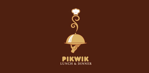
A premium logo based on food which can be used for any restaurant or any hotel where food get serve.

Most popular lifestyle portal in Slovakia and Czech Republic. Keeping you FRESH since 2011. The client approached me to redesign theirs logo. Refresher.sk need new logo that will reflect a primary activity. So I was looking for a way to simplify the logo, but also to have supported the idea and objectives of the portal. Gist for Logomark I chose symbol refresh, as you know for example, web browsers (symbol I wanted to get into logos peacefully and therefore I chose negative space), it is added to the symbol of conversation (bubble), which can be further used in communication portal (printed materials, merchandising, etc.), and the letter R. Scripture for the logo, I chose Helvetica. It is distinctive, timeless and elegant, expressing emotion is just FRESH :)
Full Project on Behance : http://www.behance.net/gallery/ARIN/2286746


Some experiment about verbicon, i hope you like :)

..

Rent of offices

ITNG provides IT services in the cloud computing. ITNG helps you migrate your applications and data to the cloud. The brand name is the acronym of IT Next Generation.
Designer: Piotr Ploch

SCHOOL PROJECT, MORE IN FEBRUARY ambigram (sign)

Designed for psëkimg, Art Director & Designer in Brazil in 2012

Da Vinci, a gelateria located in Alberta - Canada, produces handmade gelato, inspired by the best products made in Germany and Italy. The company, founded in 2015, needed a new visual identity, which expressed the added value and refinement of its products. Thus, HeadMade was in charge of developing the new brand of gelateria, and thus repositioning it in its market.

Vegan green food restaurant
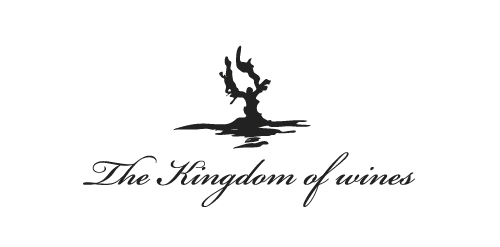
logo for exclusive wine cellar
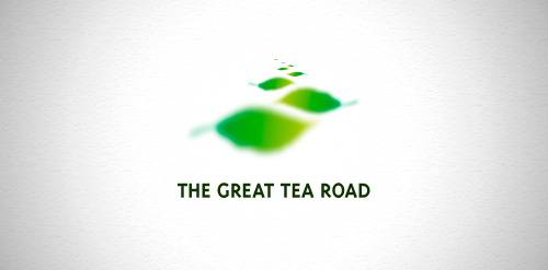
Designer: Denis Aristov Client: Ministry of Commerce of Perm Region Industry: Tourism, Festival, Event Keywords: The Great Tea Road, tourism, leaf, festival, green, footstep

REDLINE: convenience stores/gas station. CONCEPT: I tried to use just lines for this custom typeface.

Single person consulting firm who help startups with fundraising and sales.