Highest rated logos
Highest rated logos · Page 180

Identity! That's what European Decorative's architects and designers were looking for. Here is a concept logo design for their brand using minimalistic mood with wooden colors.


a proposed logo for Cinetele film
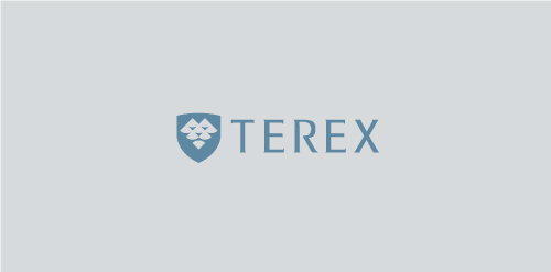
Terex Environmental Group is a hydrogeology consulting firm based in Calgary, Alberta, Canada providing environmental project management services to the energy sector.
Logo for France based company that specializes in designing new ZOO parks and services related to wildlife animals housing.


A personal logo. I was trying to find different ways to combine the two letters J and U together and after many sketches and versions, this one stuck. Open to comments and critiques!

logo for webdesigner

Logo for airlines

Like us on facebook: www.facebook.com/hunapstudio
A Textile Company

Logo for the website design and development company

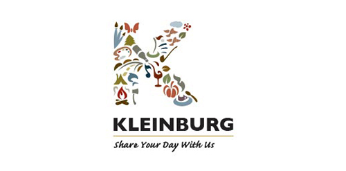
Logo concept for the Town of Kleinburg.


provides services in management and business development
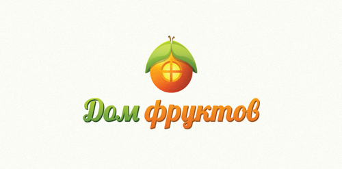
The shop of fruit and vegetables with home delivery. http://www.domfruktov.ru

For purchasing contact me.

Logo design for Student Centraal, a Dutch community for students.

OIL TRANSPORTATION COMPANY

A sleeping cat that has made a nest with his tail portraying care, safeness and help. Just for fun.

Event Flipper it is an event planning site which helps people struggling to take already developed event and flip them for the better one.

Logo for Google Chrome search extension