Highest rated logos
Highest rated logos – Page 134
Remake logo from "Jus" logo concept


Ready made logo design.
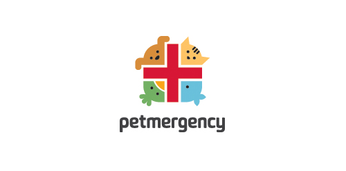
Logo for a pet health and care center.

Preschool

Logotype for security company.
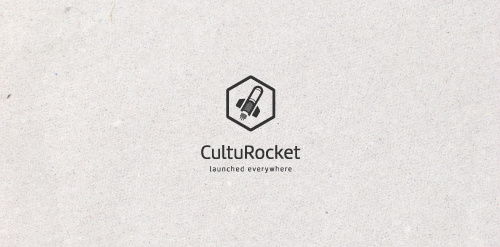
A well proportioned logo. A book used as a rocket to spread the culture. The slogan is very impressive "launched everywhere." Easily reproducible and scalable.

Design logo for breeding of english bulldogs.
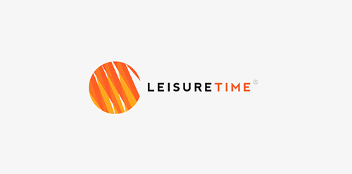
Custom logo design I did for Leisure Time in 2012.

For a manufacturer of instrument strings - Guitar, Cello, Violin, etc. Nickel Steel, Phosphor Bronze & Nylon. The mark is inspired by an Australian Lyrebird.

logo for Szeliga photography

Company sawing wood from plantations

Logo for Tres Amigos Bar

Design studio «Indi». From Indians and, a little bit, form «In Design» )

A fun take on the word terabyte and use of the word monster to imply "large" storage space.

Developed for a food science orginisation, the goal is to maximise dietry intake for the purposes of weight loss, muscle growth and/or general well being. They also develop meal plans for people with food allergies. The concept; a focus on things like protein supplements, vitamins & other nutrients in their isolated forms - such as whey, the protein strain isolated from cow's milk that aides muscle development. The bottle is half full; therefore the fruit is still growing, when the chemical mixture is at its prime, the bottle will be full & the fruit complete.

Dutch financial and trading company for crowd trading.

Logo for a new blog about lettering, typography, calligraphy, process and inspiration www.typedivision.com

Place for little artists, scientist and fun lovers.

Web-shop for girls

Logo for the online "valley of tutorials".

Cube - meeting organisation
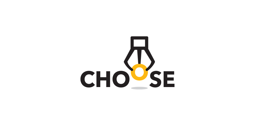
Logo for a game platform that engages people to choose only one of the best products. The idea creates a claw machine picking up the O letter to represent "Choose".
this logo is unused and for sell made by me..
Exclusive Customizable Logo at http://wp.me/s4571j-blogster