
Highest rated logos
Highest rated logos · Page 135


Trademark and corporate identity stationery products "Workmate"

Dutch financial and trading company for crowd trading.

Ready made logo design.

Customizable Ready Made Logo Design http://wp.me/s4571j-robotop

Unused proposal showing a writers quill in the form of the letter e.

Rebrand of the current log which is still featured on the website soon to be replaced. Symbol conveys attributes required by the client: 1. lower-case "r" 2. Redbox Platform 3. Connectivity 4. Convergence 5. Virtualization 6. Security

Ten small mountains forming one big mounTEN.

Cube - meeting organisation
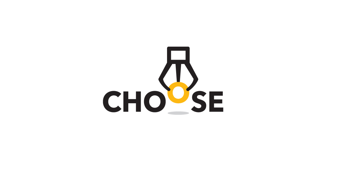
Logo for a game platform that engages people to choose only one of the best products. The idea creates a claw machine picking up the O letter to represent "Choose".

Polish Golf Union
http://www.facebook.com/yaceky
Logo proposal for client.

Muzzle - Loaders is web site, that sells guns, rifles, ammo and other hunting equipment.
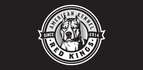
American Red Kings - They are breeders of American Staffordshire Terrier – (Amstaff) breed; sell puppies to Brazil and export to other countries. They also provide advice on breeding and animal behavior and expose their dogs at exhibitions.

Logo for an interior design company. Based on a traditional Chinese decorative element.

logo for a films and tea lovers society

Indigenous Experience is a travel company that provides holidays were clients spend time with the local tribal people from that country.

Logo of the restaurant and winery located in Warsaw. Colors from wine and interior design of local.
For fun.

Delivery of Japanese cuisine

Italian Gelato and Bakery place, located on Guadalajara, Jalisco, México.

Accessories for cats a class premium

taurus logo

Logo for consulting company