Highest rated logos
Highest rated logos – Page 114

Tourism Internet portal. Popular Tours: Egypt, Turkey, Tunisia


Rasa ( Essence) Drop In an abstract B Form.

Logo for some kids store or toy's mark

B/flying horse monogram proposal for an apparel brand.
Brand name: Big Papa's - Field: Restaurant Year: 2014 - Location: USA
Logo for "premium" content marketing agency

蘋果核(Apple Core) 休閒裝(Casual Wear);主營女性休閒裝的品牌。

Honey, I'll call back... is a bar in Moscow. Unused proposal. Their slogan was: "Drinks, music and some food'. Remember yourself in a bar when you honey calls you? Cheers!

An upcoming website for floral agreements & such.
Custom made logotype for an organic cosmetic line. Typography was crafted to show references to Aztec's wisdom, since the product was originally developed by them ages ago.
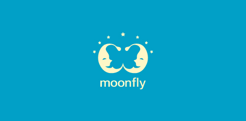
The main characters of the logo designed using positive space are two "sleepy" moons! There is however another character- hidden in the design! Seek for it!

Naragon & Naraine are a building and bridge construction company from Canada.

unused proposal for a children's brand
www.mikemark.com We needed a logo that would remind us of the broken marbles from the ancient Greek agora, a place to sell and buy, speak and debate, meet and learn. We thought that our logo version of agora should be colourful as a way to express hope, happy motives and uniqueness. We loved the idea of a circular logo because we needed balance and because we thought that this project should roll.

Logo design for a fitness/consulting, U.S.A. The company formed is a personal training/lifestyle coaching company targeting higher end clientele.


Logo for "Broker"

This logo is a perfectly balanced clepsidra which represent the stoping of time.

MoonCake Cafe logo design
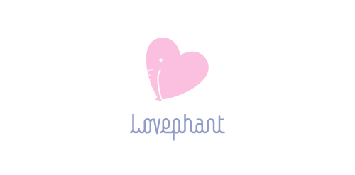
To all elephant lovers: An elephant heart or heart elephant.

Mobile application logo design for CENN caucasus environmental NGO network. The app gives you an opportunity to reveal the facts that can be a threat to our environment. Weather you’re facing forest fire, forest degradation, illegal wood trading, pollution littering and more.
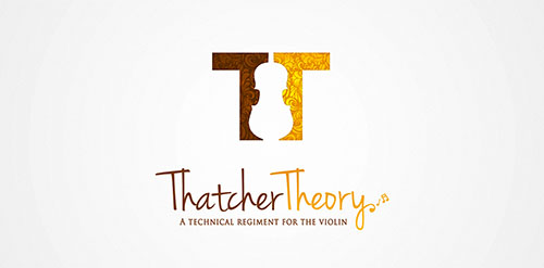
Thatcher Theory Violin Logo

Golf championship.
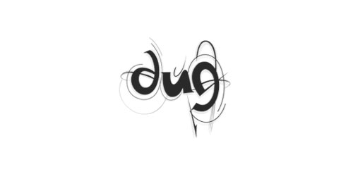
DUG (dans uten grenser) trsl. "dance without limits) A dance organisation which focuses on attracting youths to the dancefloor. By targeting all youths the goal is to make dance interesting, cool and including