
Highest rated logos
Highest rated logos · Page 116
Coffee Cup logo


The concept for "Danish Wine" incorporating a bottle of wine in their flag.

"my Dog & I" Logo developed for a dog training school.

UFO

Logo for the company producing the paper in various formats, colors and textures.
Car wheel and movie tape creative combo
Logo para indústria de equipamentos de ginástica. . Logo for fitness equipment industry.

Brand Amy Maia Alta Costura Patos de Minas, Brazil

Sign on the yacht

Starman logo
Eagle Song logo

Exclusive Customizable Logo at Eisaks Logo Design

aditya26j@gmail.com https://dribbble.com/Aditya-Chhatrala

Artizan tea producer based in Canada. Client wanted vintage handcrafted style for start-up business.

Logo for a traveling group.

A mark is a combination of a seahorse, letter O. Some people also see a man's face on a backside of the seahorse.

Unused proposal for a snowmobile related company.

Just for fun

Cheese producton

A logo created for a Japanese Restaurant called Tabe Tai (Want to Eat). The idea was to create a mark around the Japanese Torii while incorporating the restaurant's initials. Additionally, I designed the entire mark to reflect upon the ink strokes used in ancient Japanese paintings.

logo for fashion company
Trade mark of children's clothes
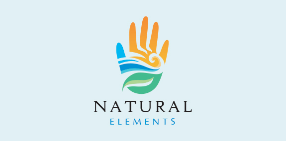
Natural and modern hand logo design with the hand created with the earth’s elements wind, water, land, sun and fire. The earth elements are beautifully incorporated into the hand design to create a seamless, distinctive logo design. https://www.logomood.com/downloads/natural-elements/
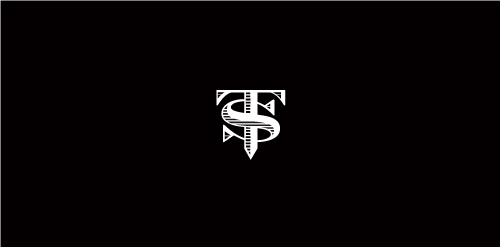
Proposal for TS (formerly named Top Streetwear), a youth fashion brand.