
Highest rated logos
Highest rated logos · Page 113

Like us on facebook: www.facebook.com/hunapstudio


little fox

Spoilerman movie blogger.

Ambigram made for CD Cover of a rock band from Florida called Unfold.
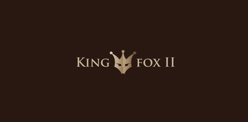
Simple royal logo with KingFox for almost any business.
Logo for "premium" content marketing agency
CENOXO - logo design. Based on customized typeface, strong C logo mark, technology, brain, development and connection.
The Bache is the name of own small business in video productions and graphic design. It is pronounced as ‘The Badzje'. Little shameless self-promotion right here: www.thebache.nl

moon beauty of women

Finalized concept for a website which lets you manage your health records online along with many other things such as health trackers, health scoring tools, smart cards access to top doctors, and intelligent alerts & reminders. Approved by the client.
Logo designed for a Dutch web design agency. It represents a fortress wall combined with a coat of arms.
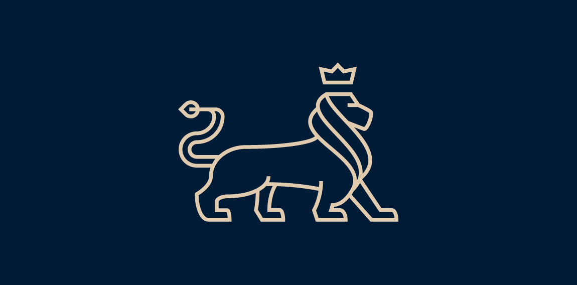
Minimalistic but sophisticated logo for swiss insurance company. I have chosen lion as the main element since it symbolicaly represent stability, trust and power. Line-art style seemed perfect since it is modern but elegant in the same time.

Logo prepared for a logo competition for a small town in mountainous region. Hills are stylized into letter U for the name of the town.
Little Kid

my new logo

logo for interior decoration and interiors

e-shop with candy & chocolate
http://www.facebook.com/yaceky

PIKE SPORT

Logo for IT-Bureau
Robotic crow logo created for micro-assembly handling station. Unused proposal.

this is a company logo design and interior architecture

Jewelery store
Copyright © 2014 Marius Fechete