Featured logos
Featured logos – Page 222
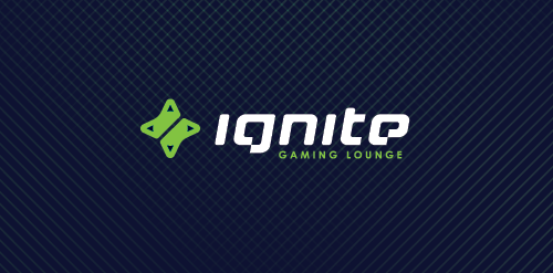
ignite is a Chicago located place where you can hang out playing in your favorite video games, enjoying a good coffee, beer, make new friendships or just having a good time with old good pals. Main objective was to obtain a mark which in clear and simple way communicate the nature of the place which represents + design custom typography to show an uniqueness of this place. We decided that the best solution would be a combination of two game controllers (symbol of game community) in the shape of the d-pad which also refers to the form of sparks, which is a direct reference to the IGNITE name. Full ID http://bit.ly/XkAZ43


salesami.com

sustainable fashion design
Organic Juice

Research and experimental laboratory.

UK Student TV Channel that broadcasts nationwide

For digital media company which makes it easier for people to create great videos by providing them a creative marketplace, a virtual Studio with professional tools and access to expert knowhow.

Restyling of the logo for shop of design sunglasses (for hipsters). www.lookatsun.ru

Ready made logo.

Logo for an online community.

Logo for courier company.

Childcare Business based in London
Logo Integration and Community Development Fund is designed with the visual legal metaphors and lofty humane Image: Dominant image of the logo is the image of the man who rose to powerful, always towards a bright future, with image sunflower stylized sun and the image of the community shared hand . Color: Logo with the dominant color Boots - Green is the color of the environment, the color of life - Orange color symbolizes energy, his color warm and integration.

International Annual Publishing Exhibition & Conference in London
Startup School Graphen. More about project: hellowoomy.ru
my logo for design
Childcare Business
Logo designed for clothing label in the UK

Logo created for a young perspective photographer. In logopack: http://www.behance.net/gallery/Logopack-Series-Two/5410911

Logo for an atelier who makes exclusive designed wear

Made for fun.

Identification of a non-existent company.
ALIFA FOUNDATIONS - ION Drinks Company

Interior design studio