Featured logos
Featured logos – Page 205
Inspection Support Network is an online "software as a service" for home inspectors. The icon is made out of all three first letters of the name ISN. Companies official website: http://www.inspectionsupport.net/


"Synerga"is a company operates on renewable energy market which is currently one of the most lucrative and safe investment fields in Poland. In its offer gives an opportunity to invest in wind farms built by themselves and share in the profits earned by them. Our task was to prepare a comprehensive visual identity through which the company will become the image of a professional and reliable partner in the investment on a large scale and to strengthen its position in the market.


The logo was designed for a Online Flower Shop. They will send flowers to your loved one directly to her/his house when you order online. This logo tries to reflect the freshness of the flowers and the products that "Kukyflor" offers. The typography of the logo was redesign to give the sensation of petals forming the word "kukyflor".
A logo for an aloe vera drink. http://www.facebook.com/drinksuperleaf

Gifts

Decoration In Saudi Arabia
MBA | University of Life
Princess Bridal is wedding studio in Viet Nam.
Innovations IT is small business, headquartered in Canada. They are professional working with best solution in Information Technology for hi tech products such as laptop, desktop and mobile phone.

Developed for a speech therapist & vocal coach based in UAE, I have developed both a Latin & Arabic typographic solution (see variations). Concept here is 'fun with pitch' - the green swirl represents travelling soundwaves, the yellow bar represents the golden note (or perfect pitch) with the blue bars representing the plus/minus discrepancy, so it’s about precision. There is also an implied smiley face, can you see it?
Entry for a logo competition for the famous dubstep dj Rusko

Book publisher, publishes books on cooking

Logo for advertising agency.
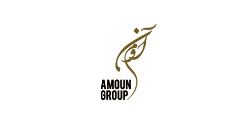
Final logo for Amoun Group.. Amoun Group included a hotel, oriental restaurant travel agency, programing agancy & an advertising agancy.. The logo reflect all themes of those companies, Arabic theme (letters) and ancient Egyptian theme (the shape looks like Horus Eye)...
This is my personal logo as a freelance designer. It's simple, my name and surname connected and creating a pencil.
This is a logo of SoftProdigy which leading brand for IT Services like Software Development, Mobile Apps development, Web designing, internet marketing & so on.
Logo for design company

Foxography

Pascana Hotel is located in different parts of Perú. The name comes from a word of the native and official Peruvian language called Quechua, which literally means “A stopover in a trip”. For Pascana Hotel the concept was to represent the peruvian culture at its best. The colors used are a characteristic of peruvian textiles. In this case they give a warm feeling to the Hotel. And the forms used are part of another characteristic of Peruvian culture, that is the use of lines and forms. This one tries to represent a place to stay. Like a native house.

Café lounge Panorama, Located at Ha Noi, Vietnam
competitive work

The logo depicts a cat of breed Sphynx. The logo is designed for various areas of business, in particular for kennel of the cats.

Travel Agency, Located at Span

Two symbols, merged within one: an eagle and a wizard