Featured logos
Featured logos – Page 208
BR monogram created out of bits.


Logo for nutrition drink, with body builder created within the negative space of two S's.


Fitness logo which shows a weightlifting dumbbell set resembling an apple core. Core exercise routines help to strengthen your core muscles. This in turn gives you better balance and stability for all other physical activities.

"Olympic" residential district

VS Monogram
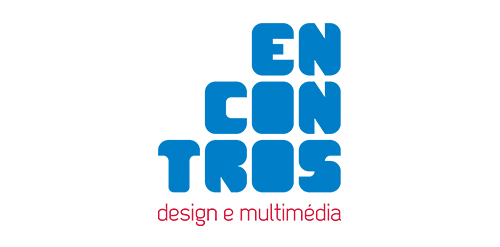
[see more in behance @ http://bit.ly/W8GJLS] Encontros Design e Multimédia is an event. It has being taken place since 2009 and consists in a week dedicated to promote and develop design and multimedia activities, workshops and meetings in the city of Braga. It's promoted by Escola Profissional de Braga. The design, organisation and communication of the event is the responsibility of a finalist student. [The brief] Encontros Design e Multimédia had a clear ambition, grow year after year, it wanted to inspire, involve and thrill the students, professionals and enthusiasts about Design and Multimedia. The logo was to be used in the website, facebook, promotional material, including posters, flyers, video, and a lot more. The goal couldn't be clearer, it had to be unusual. [The solution] The logo represents Encontros's strong ambition. It has all the elements to succeed, it's simple, relevant, it incorporates tradition, it's distinct, memorable, versatile and it stands out from the crowd. It's designed to be filled. Filled with photos, images, participants, speakers, filled with design and multimedia. It has no icons of design or multimedia and doesn't need them, it has all the qualities of both and all the creativity to be anything. [Typography] Encontros has a unique typeface, its custom and it's designed specifically for this brand. It's a bold geometric typeface designed to be filled and to get noticed in every contexts. [Colors] The colors are one of the most important elements of Encontros. The chromatic scheme is very expressive, it's a variation of the well known CMYK, providing a vast number of combinations making the brand very dynamic and inspiring as well. [see more in behance @ http://bit.ly/W8GJLS] [joserodrigues @ http://be.net/joserodrigues]

social media company.

RobabekiaMarketing.com is a website for tech marketing planes.
IT Consulting Company located in Washington D.C. specializing in Virtualization, Network Design and Cyber Security

logo inspired by leaves and grids :)

Conceptual logo for an engineering company. The logo represents a crown, a bridge and a cog.

Incubare is the latin word of incubation which means sitting on or brooding bird's eggs in order to hatch them and that's what is represented by the logo: a nest, eggs and a bird.Ideal for a maternity.

PIMP Agency Communication
Logo for vine house.
i designed this logo for a pune, india based business house which is into multiple lines of business and now lts lead by a new leader and they are expanding their presence in other industries as well as states of the country. the name of the young leader starts with " A" so i incorporated an " A " in the logo.

Logo Petits Pas. Firm for kids shoes

UK Bus Service
Recently designed logo for an young french movie director Gary Sfez.
Logo for independent art project. Shoeprint with hole.

:)

Logo Nike Air

Abou Khatwa Gomla

Museum will be located in Białystok (Poland) - city, whence in 1940-1941 more than 20 thousand citizens were taken. Basing on example of the fate of the residents of the city and the region will show the drama of deportations, which experienced the Poles and the other peoples of this part of Europe between the seventeenth century and the the fifties of the twentieth century. - See more at: http://logopond.com/gallery/detail/191635#sthash.BJV2UpsA.dpuf
Ozeal is a group of ambitious adventurers, a large family, based in London, leading different ways of life but sharing the same mission: providing all our customers with high quality, richly designed yet low-priced glasses. The idea to set up a website and sell high quality glasses at a low price to anyone in need was brought up about 3 years ago and then we started to embark on this journey. The truth is: we do enjoy it. We name our website as OZEAL. Because we are enthusiasts, we are passionate and we are carrying on our mission through this website with great zeal. Most importantly, we want to pass this zeal on to any of you.