Typographic logos (31)
Printing Studio


Logo design for an film production company, Turkey.

Vulovic pastry shop logo

A simple and minimal typographic logo in expression of its context. Made for IAPCO Meeting Masterclass theme. More: www.behance.net/gallery/19021913/Typographic-logos-lettering-2

The Motor City Chop Shop logo features a flowing action, created with curved letters, lines and shapes. All of these elements combined create a raw, compelling feeling of a chopper in motion.

Expressive typography by its meaning. Logotype for night entertainment club.
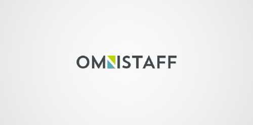
This was a commission we received from a company called Omnistaff - A recruitment Agency based in Johannesburg, South Africa. The company required a minimal logo that signified the multilateral approach they had to staffing solutions. This logo makes use of clever negative space to create the N, which just so happens to look like two arrows pointing in different directions.
Logo design for a tree surgeon.

New logo created for a bar that serves specialist beers and spirits.
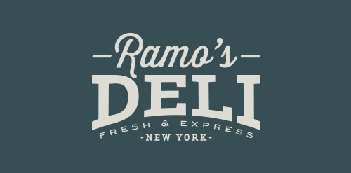
A logo created for a new deli based in NY
BELLISO - logo and mark for beauty and fashion brand.
BELLISO = from Italian words bellissimo, bellissima
http://RadekBlaska.com
BYOLA.com - fresh, bold and green brand.
Custom typeface design.
more at: http://RadekBlaska.com
Ranoro - modern, bold and dynamic logo / brand. Designed with custom typeface.
more at: http://RadekBlaska.com
Conceptual logo.

Naming & typographic logo for wine producer. The combined initials symbol expresses wine glass & wine drop.
Logo design for a online fashion store company, U.S.A.
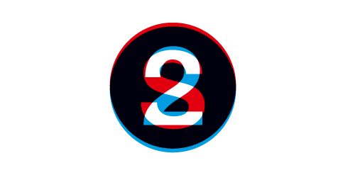
A brandmark for Second2, a design agency - concept only.

Designer: Denis Aristov Client: Panorama Industry: Food Keywords: tapas, bar, bull, Spain, bullfights, corrida, food, red, yellow, round, arena, sun, sand, typographic, T, horns

Designer: Denis Aristov Client: The Government of Perm Region Industry: Event, Non-profit Keywords: Perm City, memorandum, flag, spectral, gradient, sans, typographic, dynamic, leadership