
Type logos (157)
Logo for kids furniture brand.


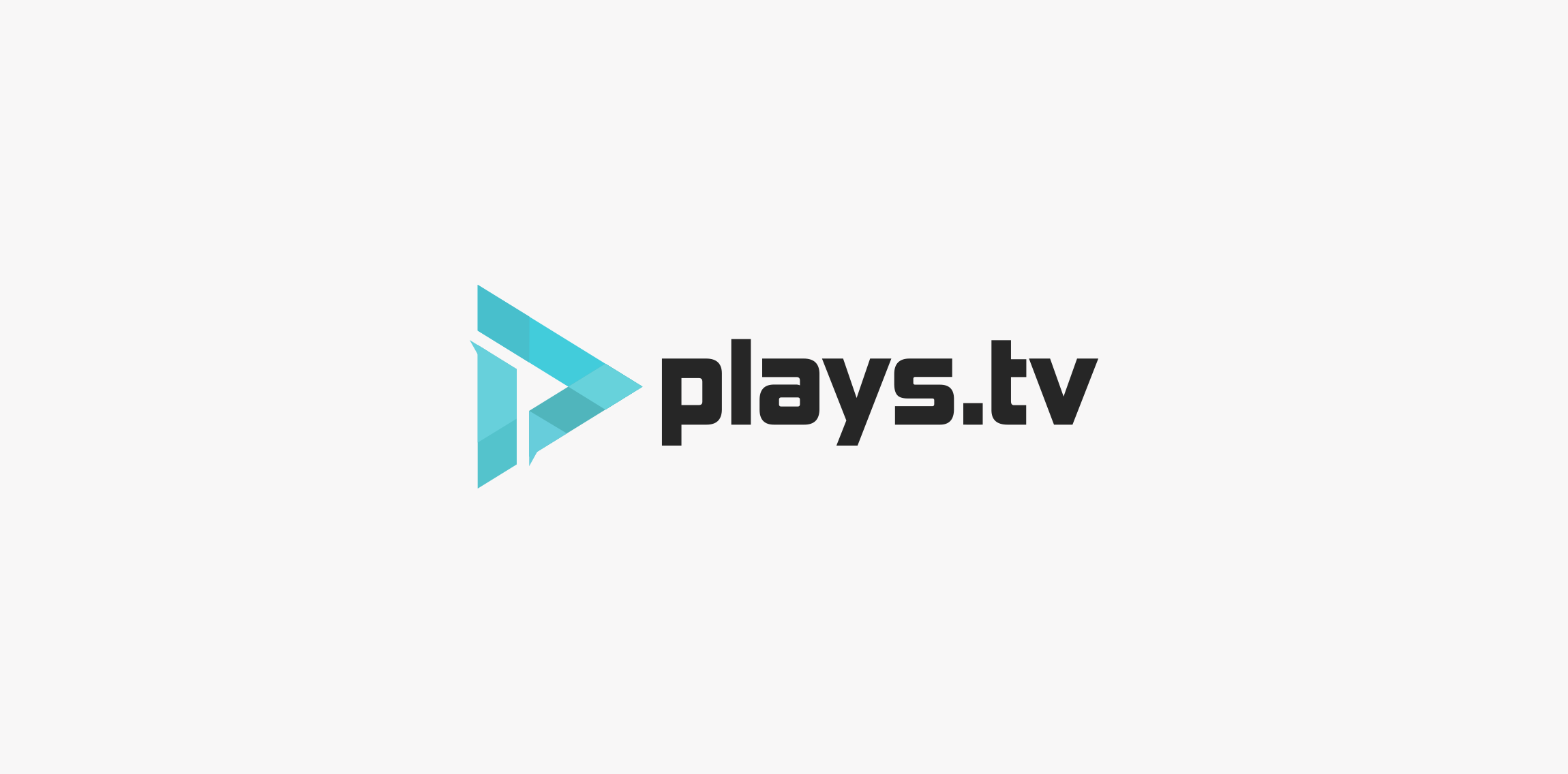
Here is a logo redesign concept for plays.tv. I tried to create something simple, modern but also keeping a bit of that gaming-ish style because that's what plays.tv is all about. The logo also shows the letter P inside the logo using negative space. Thank you for reading, if you liked how this project turned out be sure to leave a like! Ciao.
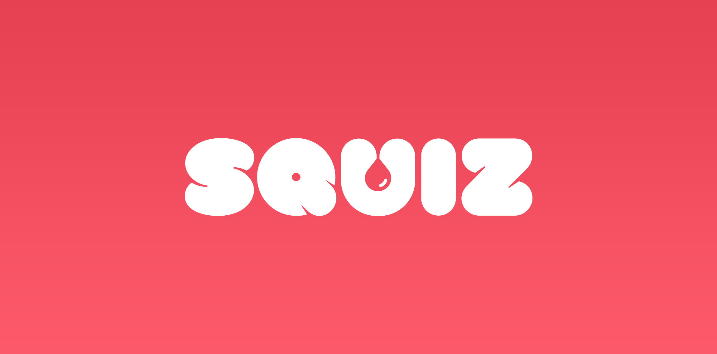
Logo design and name for quiz app.
Check out full project on my portfolio:
http://vhs-kid.com/project/squiz/

Designed for Artisan Bread Bakery called Rustic in Cyrillic

*

Afix is a Dutch internet agency specializing in online marketing and web development. I've created a custom logo type for them.
*

Rocket is a social media boost agency, that helps smaller brands to launch on the social media networks

ASTI provides skill training for Indian workers who work for international businesses.
Studio Copper is an american company that handcrafts genuine copper mugs that was born in 2015.
Playing with name & letters.
Typo illustration which i have been made in free time.
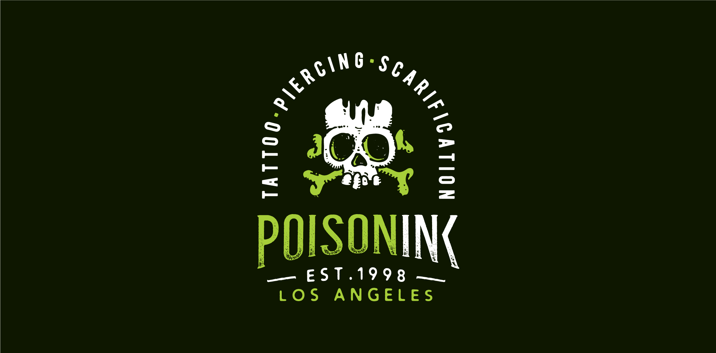
Playing around the naming, drawing & typography: Poisoning + Ink = POISONINK Dabum tsssssss!

A very simple logo design for happy co. Instead of putting a straight line below the CO part, i've made a smile, because its happy.

Wordmark crafted for developer of interactive solutions. • • • Follow us on www.instagram.com/triptic.pl
One of the brand marks I’ve done at the end 2015. „N” for clothing company from Chile. // www.dominikpacholczyk.com
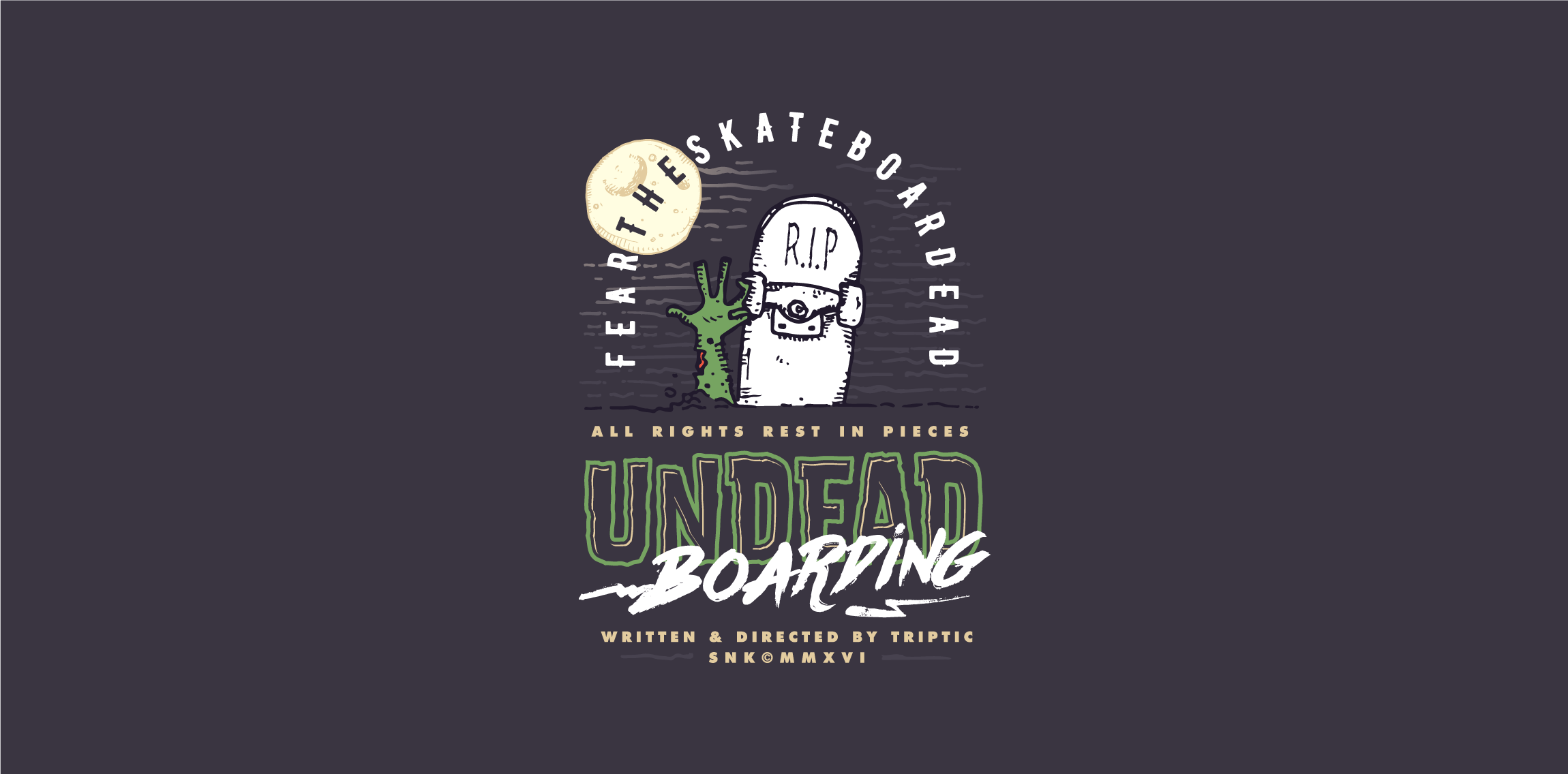
Just playing around the naming and custom letters. Follow us on www.instagram.com/triptic.pl
Conceptual logo design for internal communication system software.

Snijders is a technical wholesaler in hydraulic hoses and accessories from The Netherlands. Their products cover all conceivable connection parts for hydraulic and pneumatic components.

I tried to make logo for myself to put it in photos, projects etc. I am looking for constructive critique. :)

Conceptual logo design made for fun. Quick idea and quick execution.

This is something I done on a lunch break. 'H' is for sale.