Sans logos (5)

A logo made for a mobile service


Inspired by Super Heroes and Greek Legend, Urban Jungle designed the Guardian identity. Integrating the “G” of the product’s name into a Captain American-esque shield, and using a charcoal colour treatment on a bold stylized version of the Gotham typeface, the identity blends a vivid colour palette of pink and purple, giving the identity strength and modernity.

Designer: Denis Aristov Client: The Government of Perm Region Industry: Event, Non-profit Keywords: Perm City, memorandum, flag, spectral, gradient, sans, typographic, dynamic, leadership
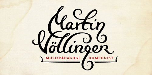
Logo design for composer, music pedagog, organist and conductor. The "g" letter is made to look like violin key. The client wanted happy and joyful look but still to represent proffesional musician.
