L logos (11)


www.facebook.com/lustra1.0 Lustra is a Facebook community that unites armenian graphic designers, illustrators and photographers.

Logo design for an printing company, Hungary

Connect the letters JSL together into one symbol

Another concept for my personal identification. Letters L & f combined in a sign placed in circle. Custom typeface.

LofLof
Logo Design for "Leyda Luz" — Personal Branding / Graphic Designer / Illustrator / Photographer /
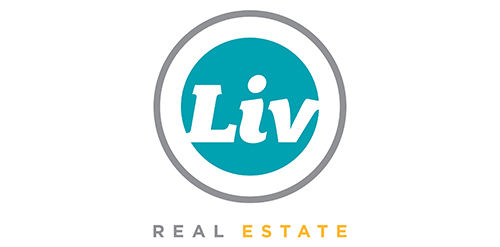
Urban Jungle was hired to develop Liv’s brand strategy, including its tagline and brand story. After clarifying its vision and defining its mission, values, personality, promise, experience, Urban Jungle then crafted the new corporate identity for the firm. The new look is simple, bold, and contemporary. It captures the essence of the firm’s fun and friendly personality while communicating its promise to help Edmontonians love where they live.
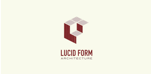
This logo is for a completely fictitious architecture studio called Lucid Form Architecture.
The icon is based on an optical illusion of a cube within a cube. Primarily, the form depicts a big cube, made of wood walls and metal-plated top surfaces, with a notch cut out of the center, resulting in a 3-D "L" shape. However, the longer one looks at this, perception begins to shift, resulting in a couple of different interpretations: 1) a small cube with a wooden wall and metal-plated bottom, in the corner of a room, hovering near the top of a tiled ceiling; 2) a room, tilted 90° clockwise, with hardwood floors, tiled walls, and a cube with a wood countertop and metal-plated side on the floor in the corner. This perception shift is important to the name, because it presents an ironic twist. To make "lucid" means to make clear, and while the icon seems to initially baffle and confuse, it ultimately encourages the viewer to challenge his or her preconceived notions of "perception." So too is the Lucid Form methodology for creating seeming impossible structures.

Identity system for a wedding

logo for languag learning portal