Healthcare logos (9)

Conceptual logo design showing a medical Caduceus and technology symbols combination. For sale.


Logo for a general practice.

Exclusive Customizable Logo at Eisaks Logo Design.

Exclusive Customizable Logo at http://wp.me/s4571j-tombro


Inspired by Super Heroes and Greek Legend, Urban Jungle designed the Guardian identity. Integrating the “G” of the product’s name into a Captain American-esque shield, and using a charcoal colour treatment on a bold stylized version of the Gotham typeface, the identity blends a vivid colour palette of pink and purple, giving the identity strength and modernity.
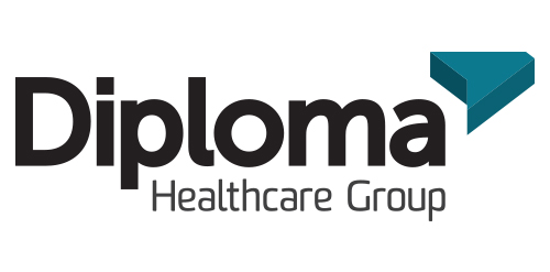
Inspired by the ancient Japanese art of folding paper, the negative space from an origami-styled “D” creates Diploma’s icon. Using a deep charcoal colour treatment on a bold stylized version of the Museo Sans typeface, the identity combines vivid aqua and chartreuse colours, designed to strengthen the company’s fortified position as “the definitive partner for medical device sales in specialized healthcare markets.”
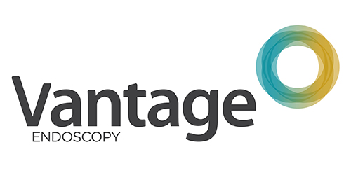
Inspired by the Spirograph, Urban Jungle designed the identity using a combination of four semi-transparent aqua and ochre circles. The circles symbolize the convergence of two unique corporate entities into one new corporate brand identity — Vantage. Using charcoal for the typeface, the identity blends a vibrant colour palette giving it a fresh, smart and energetic feel, and reflects the youthful and contemporary edge of the company.

I was approached by new organisation 'Monitor Healthcare' to design their logo and brand identity.
Monitor Healthcare aim to provide people all around Africa with free medical advice via online and telephone methods. As this service is to be for the full continent I wanted to create a logo that would represent this unity.
The different colours of each section of the cross are representative of the North, East, South and West regions of Africa. The individual colours were picked based on the flags of the countries within each region.
The white cross in the middle of the logo is to symbalise the unity of the continent which Monitor Healthcare aim to provide.