Circle logos (97)
This logo is for a completely fictitious fish market.
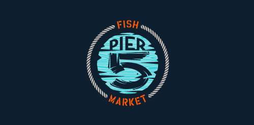
The idea came to me when I discovered that it was possible to achieve a fish shape in the negative space within the bowl of the number 5. Dubbing my hypothetical company Pier 5 Fish Market, I created this illustrative mark in the hopes of really capturing the spirit of the nautical and maritime aesthetic. Type is custom for "Pier" and also the number 5, which is hand-rendered to look like it was painted on a wooden sign with a very wide, worn-out, thick-bristled brush. While it was important for the fish to show in negative space, it needed to look like a seemingly happenstance result of logical, real-world brush strokes. This is the minimal, alternate version of this logo.
Click here to see the case study for this logo, which chronicles its development, and includes full design rationale, sketches, electronic roughs, and alternate designs.


Logo for cheese brand. The name belong from a popular trap for fish in the amazon region.

Roast will be selling high quality finished coffee, hot choclates and other coffee related beverages in their stores/bars in Sidney. The colored concentric rings stand for the roasting process of a coffee bean.
http://roastespresso.com.au/
Logo design created for Sir Creative, my online freelance portfolio identity. Visit me at: www.sircreative.com
Email me: art@sircreative.com
www.mikemark.com We needed a logo that would remind us of the broken marbles from the ancient Greek agora, a place to sell and buy, speak and debate, meet and learn. We thought that our logo version of agora should be colourful as a way to express hope, happy motives and uniqueness. We loved the idea of a circular logo because we needed balance and because we thought that this project should roll.

Foxography

Unused logo for Team Sports Manager App.
For typography & graphics academic circle in Wyższa Szkoła Technologii Informatycznych w Katowicach.
Ozeal is a group of ambitious adventurers, a large family, based in London, leading different ways of life but sharing the same mission: providing all our customers with high quality, richly designed yet low-priced glasses. The idea to set up a website and sell high quality glasses at a low price to anyone in need was brought up about 3 years ago and then we started to embark on this journey. The truth is: we do enjoy it. We name our website as OZEAL. Because we are enthusiasts, we are passionate and we are carrying on our mission through this website with great zeal. Most importantly, we want to pass this zeal on to any of you.

Human Rights A flower a symbol of life, built with people. Multi-ethnic and multi-colored logo. :::::::::: File variations :::::::::: http://applexlogos.blogspot.com/2011/11/un-logo-per-i-diritti-umani.html

Inspired by Super Heroes and Greek Legend, Urban Jungle designed the Guardian identity. Integrating the “G” of the product’s name into a Captain American-esque shield, and using a charcoal colour treatment on a bold stylized version of the Gotham typeface, the identity blends a vivid colour palette of pink and purple, giving the identity strength and modernity.
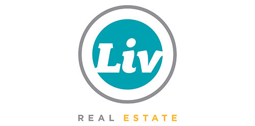
Urban Jungle was hired to develop Liv’s brand strategy, including its tagline and brand story. After clarifying its vision and defining its mission, values, personality, promise, experience, Urban Jungle then crafted the new corporate identity for the firm. The new look is simple, bold, and contemporary. It captures the essence of the firm’s fun and friendly personality while communicating its promise to help Edmontonians love where they live.

Logo for online math forum. Red table and red greek letter "pi" (3.14 in math) so RED SMART TABLE.

Logo for Italian restaurant made by Logodesigner studio. In use by client.

THE wedding ceremony name in chinese is "喜喜". Using the first name in chinese of each name which call "黄" and the name first name of "吴" to combine together with "喜喜" to be this logo. Playing the typo of chinese in this logo.
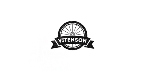
Logo concept for company which creates unique bicycles. Client requested some vintage and retro mood.
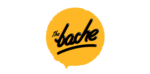
The Bache is the name of own small business in video productions and graphic design. It is pronounced as ‘The Badzje'. Little shameless self-promotion right here: www.thebache.nl
Logo design for Southern Natural Foods
Logo design proposal for a Canadian financial firm based in Ottawa.

Logo for a telecommunications company.

This is a crest I'm working on for my two brothers that are going to be my best men in my wedding. I plan on using it to put on a pint glass or beer mug. The year in the middle will represent the year that they were born.