
Circle logos (97)
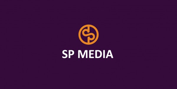
Logo is a junction of letters S and P in a simetrical sign. The junction also stylized in a infinity symbol which presents perfection and universal solutions. The sign may be also used as loading icon, application button, linkage icon etc.


Our logotype.

New simple logo for company from Germany.
Unused concept for digital agency. - - - follow us on www.fb.me/triptic.design - -

The AUthentic logo design resembles the map of Australia. It presents a strongly formed approach suitable in the coffee roasting industry. With this new brand name, you can establish new position in the coffee industry.

Copyright © 2014 Marius Fechete

Exclusive Customizable Logo at http://wp.me/s4571j-overtop

Trzech Kumpli - Browar Lotny (Three Pals - Flying Brewery). Indie beer.

Internet shop selling materials for handicrafts.
Monogram for grocery company

Client: Dream Photo Tour Location: US Branding Agency: Bratus

Web application that helps to effectively manage time, employees/co-workers, customers, and sales. DayTab supports the process of customer communication, collaboration and information sharing within the company. Its functionality centers around the concept of structure, hence the simple "tree" metaphor in the logo. The symbol is built only with circle segments and - with a bit of imagination - you could even see human silhouettes there. It shouldn`t require much effort to notice the "D" initial.

Personal trainer services.

Car dealer who sells mainly ford mustangs and occassions.

Logo for a painter/decorator

Regiobloemist.nl delivers flowers in any place in the Netherlands. The logo can be viewed at www.regiobloemist.nl
A logo monogram created from the first letters of company's name and, actually the owner's name.
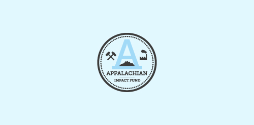
A concept made for a investment fund in the appalachian region - strong mark showing the past and the future of the region - coal mines, factories, business ect.

There's only one company for your event. Everything points to your event...

361º does just that little bit more during the organization of events. They do offer more than 360º degrees. It's the one degree that matters.

Logo for a company that stands for sustainable, industrial lighting solutions, aimed at businesses.

Brand name: Jin Sha Blog - Field: Travel, Restaurant & Resort - Year: 2013 - Location: Austria - Web: www.jinshablog.org - More About It: http://www.behance.net/gallery/Jin-Sha-Blog/9836717
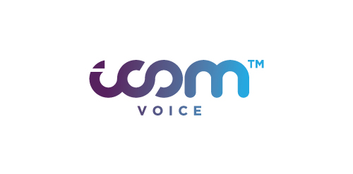
Logo design by Mehdi Hassan Liverpool for iCom Voice, one of the most promising Telecommunication Service Providers based in the UK.