Character logos (46)

Splashy logo made in a complete 3D finish.


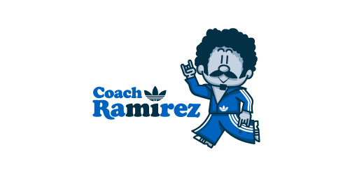
Fictional logo for an Adidas-themed résumé. This is in no way affiliated with Adidas.
Earlier this year, Adidas Originals had an open Design Director position in their Portland HQ, and, being a lover of the brand, I decided to apply. To demonstrate not only my skills as a graphic designer, but also my knowledge and respect for the adidas brand and its legacy, I designed a self-promo booklet (a highly-conceptual adaptation of my current résumé) that is aesthetically inspired by adidas Originals marketing brochures. The booklet chronicles the accomplishments of a fictional alter-ego, Coach Ramirez — an adidas track suit wearing, afro'd, mustachioed designer — and is written as if he's actually the Design Director at adidas Originals. Sadly, I didn't get the job.
Click here to view my Flickr stream for full design rationale and additional images.

Logo design for non-profit organization.The logo was inspired from mothers around the world and affection and love for their children.I just tried to communicate that feeling with this design

final logo for Indie game development house.

Ready made logo.

Accessories for cats a class premium

cafe bar
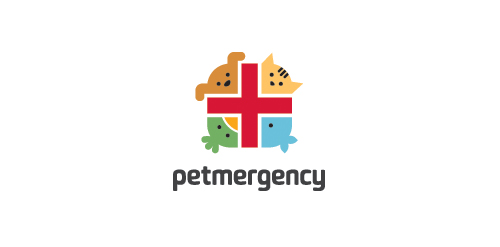
Logo for a pet health and care center.
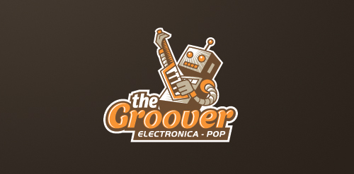
Logo for an iOS music app specializing in electronica-pop genre.

Logo for a content website for online freelance writers.

Experimental / concept work showing a friendly astronaut character.
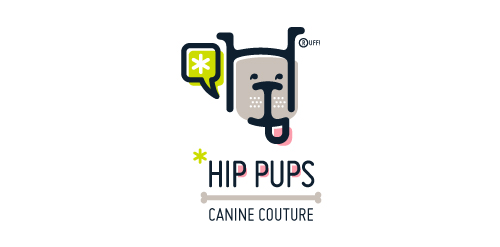
This fictitious company logo is the result of happenstance typographic exploration. I was playing around with H and I letterforms set in Platelet, and, after placing the I within the H, I noticed that it started to look like a dog face. After some modification, and with the addition of a curved P for an extended dog tongue, the resulting typographic illustration spelled "HIP." I thought it would be fun to name this fictitious company Hip Pups, which could be a shop that sells high-end dog accessories. The Registered symbol is integrated creatively into the mark by spelling "RUFF!"

fail stuff cought on camera (some streaming videos for fail clip)

My own logo