Blue logos (328)
monogram for my son Oliver Kozel :)


The Printing Company I work for recently rebranded. This is the logo I designed for us and we currently use.
The client want it a Latter logo something luxury and elegant with the GP so our designer figure it out a unique and great way how to connect Those "GP" and the design got a luxury and modern touch. www.prowaystudios.com
A logo for a colony building at Nilgiris, India.
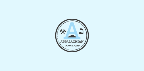
A concept made for a investment fund in the appalachian region - strong mark showing the past and the future of the region - coal mines, factories, business ect.
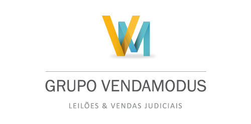
Grupo Venda Modus is a housing and auctioning group. Spot Creative Media designed the new identity, refreshed and updated their current website.
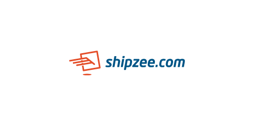
Hi, friends! My new logo for transatlantic shipping company, icon symbolizes package and wings, which means fast and secure service.
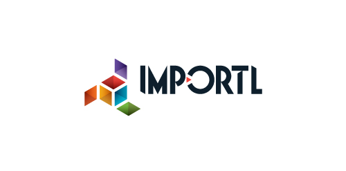
This is a logo for a completely fictitious entity named IMPORTL, which could be an open source web development site, or some type of developer software.
The idea is that the triangular facets form a series of open holes, or "portals," in multidimensional space. The central facets can also be seen to form a cube which is open on three sides. Lying before each opening is another opening on that side's respective "floor," yet, in an Escher-like paradox, where spatial orientation is an irrelevant construct, there is no floor. There is no up, down, left, right, back, or forth. This hyperspatial environment suggests infinite possibilities for the arrangement, manipulation, and exchange of data.
For color, the idea is that the primary colors that form the central cube beget the secondary colors that rotate outward, suggesting expansion, transformation, evolution.
The mark employs a custom typeface that compliments the angularity of the mark.
Click here to see the case study for this logo, which chronicles its development, and includes full design rationale, sketches, electronic roughs, and alternate designs.

Logo design for social media management company
This logo is for sale. 1. Fully editable eps and ai file. 2. Lifetime Customer Logo Support. 3. Free revisions. ie; name, color, background and other minor details. Buy it here: Quick and easy! More info? email me: ricky.laurente@gmail.com Thanks!
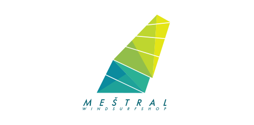
Meštral = mistral (wind), logo for windsurf shop. The shape represents windsurf sail and was created from triangles and stripes that come across. You can feel the wind blowing and speed.
Unused proposal.
custom luxury suits
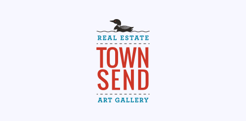
We recently completed this logo for Townsend Real Estate & Art Gallery in Maine. She wanted the logo to encompass the fresh coastal air of Southern Maine.
Logo design for a Consulting – Import / Export company, Morocco. Created by Hatim Alami
A new logo for a travel photographer.
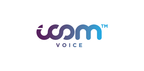
Logo design by Mehdi Hassan Liverpool for iCom Voice, one of the most promising Telecommunication Service Providers based in the UK.
Logo for souvenir shop. One among rejected.
embryo