Blue logos (328)
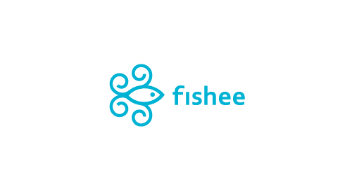
Just playin with ideas – fishee


This logo is about a network & security agency.


This is the symbol for Crown Tenant Advisors, a Medical Realty Consutation Firm. The intent was to give a new company a simple, recognizable identity by incorporating a skyline into a crown.
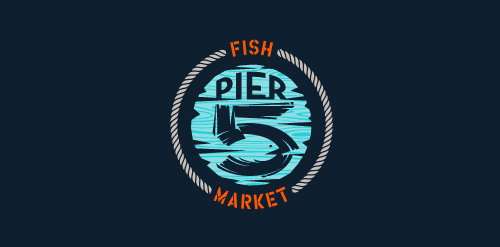
This logo is for a completely fictitious fish market.
The idea came to me when I discovered that it was possible to achieve a fish shape in the negative space within the bowl of the number 5. Dubbing my hypothetical company Pier 5 Fish Market, I created this illustrative mark in the hopes of really capturing the spirit of the nautical and maritime aesthetic. Type is custom for "Pier" and also the number 5, which is hand-rendered to look like it was painted on a wooden sign with a very wide, worn-out, thick-bristled brush. While it was important for the fish to show in negative space, it needed to look like a seemingly happenstance result of logical, real-world brush strokes. This is the minimal, alternate version of this logo.
Click here to see the case study for this logo, which chronicles its development, and includes full design rationale, sketches, electronic roughs, and alternate designs.
A logo for a online different services.

little Bird logotype
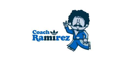
Fictional logo for an Adidas-themed résumé. This is in no way affiliated with Adidas.
Earlier this year, Adidas Originals had an open Design Director position in their Portland HQ, and, being a lover of the brand, I decided to apply. To demonstrate not only my skills as a graphic designer, but also my knowledge and respect for the adidas brand and its legacy, I designed a self-promo booklet (a highly-conceptual adaptation of my current résumé) that is aesthetically inspired by adidas Originals marketing brochures. The booklet chronicles the accomplishments of a fictional alter-ego, Coach Ramirez — an adidas track suit wearing, afro'd, mustachioed designer — and is written as if he's actually the Design Director at adidas Originals. Sadly, I didn't get the job.
Click here to view my Flickr stream for full design rationale and additional images.

For a local anesthesiologist team in the ulm. They wanted the town's landmark incorporated somehow in the logo. The Minister of ulm is the tallest church in the world. For those who don't know the landmark of ulm follow this link for more information: http://en.wikipedia.org/wiki/Ulm_Minster
Music band from Berlin
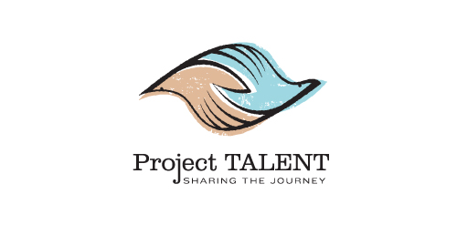
Unused proposal for an education-based initiative to reconnect with participants of a 50 year-old national survey of high school student aptitude in math, reasoning, and language. The current initiative aims to share these participants' stories from the past 50 years, and the collected data could be used in a variety of academic, economic, sociological, and health-related ways.
This mark is steeped in uplifting, motivational symbolism. It's constructed such that it could represent two hands clasped, two birds in flight, or even one hand cradling or releasing a bird. The hand-drawn line quality, typography, and offset color evoke a nostalgic '60s feel. Unused proposal.
Background screening intelligence
A brandmark for Second2, a design agency - concept only.
Leopardo is my personal mark which is a mark of a running cheetah describing by spirit and my attitude.
Logo design for the graphic design studio called 'nekarstudio'.
Mobile application logo : enjoy exclusive benefits in Saint-Tropez !
Real estate blog in Los Angeles
Logo for a company producing uniquely scented Bath Bombs.
Logo design for Market Events, a corporate event planning organization.