Faura

‘Conversations’ are at the core of the Faura brand. The Faura community is all about talking, listening and communicating. Therefore, we highlighted that aspect in the visual identity by using a minimalistic representation of speech bubbles in the logotype.
Jurny

The Jurny experience begins at your home, and ends when you check out at your destination. Jurny covers everything in between, and gives you peace of mind. The Jurny logo conveys that ‘all-inclusive’ experience. Rounded custom typeface highlights the easiness to use and the approachable nature of the brand.
Stage on 8th

Stage is an apartment building project in Los Angeles. It’s on 8th street and we wanted to make 8 a characteristic property of their brand identity, so we designed a unique first letter that reads both ‘S’ and ‘8’. That unique character became one of the main aspects of their campaigns.
Medutopia
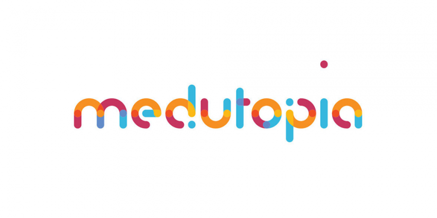
In the creative brief that we composed together with the client, two main concepts came up, which were ‘Utopia’ and ‘Fun’. The client wanted to underline the ‘Utopia’ concept and requested the visual identity to make the audience feel the fun aspect, as it is an integral part of the courses they host.
Deep Gene
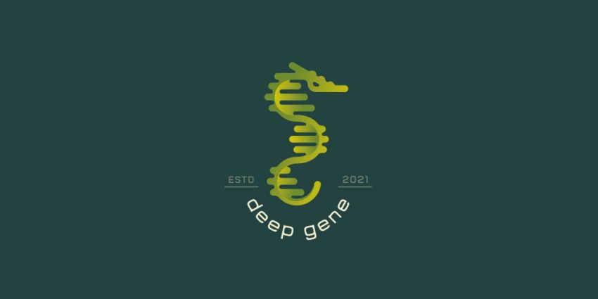
Clean and modern scientifical themed logo design featuring a DNA double helix design to form a distiguished seahorse.
Hide and Seek

‘Hide and Seek’ is a web design and marketing service for those who feel like they’re playing a game trying to be found by their customers. The logo features a child-like style with bright colors, perfectly combining vibrant orange and turquoise for a fun and playful look.
Jaskiniowiec
Logo for a stone company making a variety of natural stone arrangements (marble, granite and others). More at https://jaskiniowiec.pl/


House Care
A logo that represents concern for housing, very suitable for building/home insurance companies and building contractors