Shopping Point
Shopping bang and location pin logo concept.
Looking for a custom logo design?
I’d love to help! Contact me at hello@logofarmers.com
Letter S+G Interlocking
Excited to share this modern logo design featuring the interlocking letters ‘S’ and ‘G’. This sleek and minimalist logo symbolizes connection and synergy, making it ideal for brands looking for a contemporary and professional identity.
Concept: The interlocking ‘S’ and ‘G’ design represents unity and collaboration. Design Approach: Clean lines and a minimalist style ensure versatility and elegance.
This logo is available for sale.
Contact me for detailed information.
Looking for a custom logo design?
I’d love to help! Contact me at hello@logofarmers.com
Leaping Cat Logo Design
This dynamic logo features a stylized cat in mid-leap, capturing the essence of agility and playfulness. The cat’s sleek, black silhouette forms the arc of a jump, while the word “Jump” beneath emphasizes motion and energy.
The minimalist design ensures versatility and easy reproduction, making it perfect for brands related to sports, fitness, entertainment, or any business that wants to convey a sense of dynamism and vitality.
Looking for a custom logo design?
I’d love to help! Contact me at hello@logofarmers.com
Direction Logo icon
This simple and elegant logo is the perfect way to represent your business or organization. The word “Direction” is written in a bold, sans-serif font, and the letters are arranged in a slightly curved line. The logo is easy to read and understand, and it is visually appealing.
This logo is available for sale.
Contact me for detailed information.
Looking for a custom logo design?
I’d love to help! Contact me at hello@logofarmers.com
Number 2 & 8 Logo Design
A sophisticated monogram logo featuring the number 28 in a clean and modern line style. Perfect for anniversary celebrations or business branding.
Looking for a custom logo design?
I’d love to help! Contact me at hello@logofarmers.com
G for Ghost Logo
This logo takes a delightful twist on the letter “G” by cleverly using a friendly ghost! The ghost itself forms the negative space for the letter, making it a unique and memorable design.
Concept: A playful logo where a friendly ghost creates the letter “G” through negative space.
Character: With big, round eyes and a warm smile, the ghost brings a charming and approachable feel to the design.
Applications: Perfect for businesses or products wanting a fun and whimsical vibe. Ideal for gaming companies, children’s entertainment, educational apps, or even personal brands.
Looking for a custom logo design?
I’d love to help! Contact me at hello@logofarmers.com
Negative Space Deer Logo Design
I was interested in exploring the concept of negative space with this design, and I wanted to create a logo that was both simple and complex at the same time. I think the deer’s head is easily recognizable, but there is also a lot of detail and movement in the negative space.
I believe this logo would be well-suited for a business or organization that is creative and innovative. Maybe a tech company, a design studio, or a wildlife conservation organization?
This logo is available for sale.
Contact me for detailed information.
Looking for a custom logo design?
I’d love to help! Contact me at hello@logofarmers.com
Creative Bunny Logo
The logo is simple and straightforward, but it is also effective and memorable. The black bunny with wings is a unique and eye-catching image, and it is likely to stay in the minds of viewers. The text “BUNNY” is also clear and easy to read, and it helps to reinforce the brand identity.
This logo is available for sale.
Contact us for detailed information.
Looking for a custom logo design?
I’d love to help! Contact me at hello@logofarmers.com
Thunder Horse Logo Design
This logo is a combination of a horse head and a lightning bolt, two symbols of power and speed. It represents the strength and innovation of your company, as well as your commitment to providing your customers with the best possible products and services.
The logo is bold, minimalist, and timeless. The black and white color scheme is simple and elegant, and it allows the logo to stand out on any background.
This logo would be a great fit for a variety of businesses, including automotive companies, energy companies, sports teams, and technology companies.
This logo is available for sale.
Looking for a custom logo design?
I’d love to help! Contact me at hello@logofarmers.com
OP letter logo
Minimalist Lettermark Logo (O/P)
This bold and clean lettermark logo combines the letters “O” and “P” in a sleek, minimalist style. The seamless integration of shapes creates a modern and versatile design suitable for a variety of industries, from tech startups to lifestyle brands.
This logo is available for sale with an exclusive license. Contact hello@logofarmers.com to make it yours today!
Quality Resources Asia
A German founded company that was originally based in Hong Kong, but is now relocated to Germany.
As a product-safety company, quality testing and assurance is vital for peace of mind. It was with this in mind that the symbol, by combining the “Q” and “R” references their branding as: the product quality detectives. In turn this “QR” device can serve as a Quality Mark to then further reassure clients and consumers alike that the products are as safe and reliable as they can be.
LEES Asia Limited
Instead of spelling out the full name, Locally Enabled Energy Solutions, the logo is made up from the four initial letters to aid recognition and ease of branding. They are specialists in environmentally-sustained power generation technology and supplies. Therefore the main colour is green. The upper portions of the “E”s and the “S”, however, are designed as a blue flame. In power generation terms this is crucial; it signifies the colour that is present when 100% of the available combustible fuel is being used, in other words: ZERO resource wastage/ TOTAL efficiency.
All Saints
This logo was designed for a church in New Zealand, All Saints in Nelson. While they had an existing logo, it was felt by the leadership and the wider congregation that it was in need of a much-needed refresh. They were hopeful that they could retain the tree as a main device but they weren’t sure if that could be done. They also wanted a logo that would also serve to symbolise they had solid foundations as a church, along with a strong fellowship that welcomed everyone, while celebrating the cultural heritage and diversity of New Zealand. They were convinced they were asking for too much.
WayMaker
The name conveys the notion of being the consultant to guide clients in the best manner of approaching, solving and developing all aspects of their corporate design needs. It also corresponds to Wayfinding, the literal method of people navigating any environment; physical (e.g. buildings; complexes); digital (e.g. websites/ UI etc.) or notional (e.g. originating and/or developing an overall corporate/ branding strategy and how to progress through the implementation of the same). These are the company’s services. The main device of this identity for WayMaker is based on the left pointing arrowhead, which (after straight ahead), is the main directional priority in wayfinding (as in: go this way). This also helps to form the letter “k” which is intertwined with the “y”. Together these suggest the form “UK” which, along with the colours (Red on white) denote the origin of the founder; while in reverse are the colours of the Hong Kong flag, that speaks to the location of the company.
A L P
The logo incorporates the first name initial of the three family members of the founder. A, L, P configured into the two Austrian alpine mountain peaks nearest the founder’s home (symbolising the founder “A” and his wife “L”), and the rising sun (which represents his daughter “P”) which symbolises the promise of the future and the need for and focus on, sustainability. The company was established in Hong Kong to promote the generation of electricity using innovative technology with environmentally sustainable resources.
Lever Style
The symbol was designed for Lever Style and is a combination of the “L” and “S” configured in the form of a clothes hanger. This not only signifies the fashion industry but also the wide variety of garments that this company designs, develops and manufactures for some of the world’s largest and best-known fashion brands. Lever Style is headquartered in Hong Kong and has its main operations in Shenzhen, China. Its clients though are spread across the world.
Legacy Garage Doors
This logo captures the essence of a canadian based garage door repair service company with the modern design of maple leaf and the the core of the business garage doors in the center of the logo
Mysterious Tibet
The Tibetan Plateau, snow-capped mountains, glaciers, canyons and other natural landscapes are breathtaking, and the Tibetan religious culture is also one of the reasons for its mystery. The shape of the Chinese character “藏” and the religious colors highlight the mysterious characteristics of Tibet.
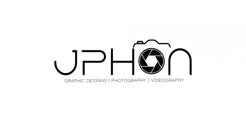
JPHON Camera
To simplify the logo while maintaining its core elements, here’s how you could approach it:
Typography:
Keep the same clean and modern font, but consider making the lines slightly thinner to enhance the minimalist feel.
Icon:
Retain the “O” as a camera lens, but remove the camera outline above it. This will keep the focus on the lens, simplifying the overall design.
The lens shutter inside the “O” can be kept as is or simplified into fewer segments to make it more abstract and clean.
Text:
Consider reducing the tagline “Graphic Designs | Photography | Videography” to a single keyword or phrase that encapsulates all three services, such as “Creative Services.” This will reduce visual clutter.
Alternatively, you could remove the tagline altogether to focus purely on the brand name.
Color Scheme:
Stick with the monochromatic color scheme but reduce the contrast slightly by using a mid-tone gray instead of stark white for the text and icon.
Layout:
Center-align the text with the simplified “O” icon to create a balanced, symmetrical design.
Remove or minimize the social media icons and contact information; these could be presented elsewhere, such as on a business card or website, rather than in the logo itself.
By applying these changes, the logo would be more streamlined, focusing purely on the brand name and the simplified camera icon, achieving a clean and minimal aesthetic.


