Lever Style

The symbol was designed for Lever Style and is a combination of the “L” and “S” configured in the form of a clothes hanger. This not only signifies the fashion industry but also the wide variety of garments that this company designs, develops and manufactures for some of the world’s largest and best-known fashion brands. Lever Style is headquartered in Hong Kong and has its main operations in Shenzhen, China. Its clients though are spread across the world.

Legacy Garage Doors
This logo captures the essence of a canadian based garage door repair service company with the modern design of maple leaf and the the core of the business garage doors in the center of the logo

Mysterious Tibet

The Tibetan Plateau, snow-capped mountains, glaciers, canyons and other natural landscapes are breathtaking, and the Tibetan religious culture is also one of the reasons for its mystery. The shape of the Chinese character “藏” and the religious colors highlight the mysterious characteristics of Tibet.


JPHON Camera
To simplify the logo while maintaining its core elements, here’s how you could approach it:
Typography:
Keep the same clean and modern font, but consider making the lines slightly thinner to enhance the minimalist feel.
Icon:
Retain the “O” as a camera lens, but remove the camera outline above it. This will keep the focus on the lens, simplifying the overall design.
The lens shutter inside the “O” can be kept as is or simplified into fewer segments to make it more abstract and clean.
Text:
Consider reducing the tagline “Graphic Designs | Photography | Videography” to a single keyword or phrase that encapsulates all three services, such as “Creative Services.” This will reduce visual clutter.
Alternatively, you could remove the tagline altogether to focus purely on the brand name.
Color Scheme:
Stick with the monochromatic color scheme but reduce the contrast slightly by using a mid-tone gray instead of stark white for the text and icon.
Layout:
Center-align the text with the simplified “O” icon to create a balanced, symmetrical design.
Remove or minimize the social media icons and contact information; these could be presented elsewhere, such as on a business card or website, rather than in the logo itself.
By applying these changes, the logo would be more streamlined, focusing purely on the brand name and the simplified camera icon, achieving a clean and minimal aesthetic.
Vanguard Worship Logo

To simplify the logo and still convey that “God is greater than our problems,” you can approach it as follows:
Icon Simplification:
V + W: Retain the “V” and “W” as the core elements of the logo.
Mountains: Simplify the mountains into a single, minimalistic peak or a smooth curve that suggests overcoming challenges.
Cross or Arrow: Integrate a small cross or upward arrow above or within the “V” to subtly symbolize God’s presence.
Text:
Use a clean, simple sans-serif font for the text “Vanguard Worship.”
Position the text directly below the icon, centered and aligned, to keep the design clean and organized.
Colors:
Stick to one color, such as a dark gray or muted green, to maintain a calm and focused aesthetic.
Layout:
The logo should be a straightforward combination of the icon (V + W with a peak or cross) and the text underneath, without any additional elements or embellishments.
This design would communicate the message effectively while staying minimal and easy to recognize.
AQP Logo
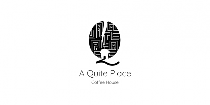
the AQP logo, I focused on a minimalist design. The logo features a simple coffee bean, representing freshness, with subtle smoke lines to evoke the warmth and aroma of a coffee house. The design is clean, capturing the essence of a cozy coffee experience in a straightforward way.
Plant Of Renown Church
Proud to unveil our logo, crafted with purpose. The Tree, Dove, Tulip, and Fire within it symbolize the essence of Jesus in our lives – Great Vine, Peace, Love, and Passion. It’s more than just a design; it’s a reflection of the values that guide us.
3D Modern Cube With Elegant Letter D Logo

Logo design for sell of 3D Modern Cube With Elegant Letter D. Suitable for any industry.
Modern and Elegant Cute Letter G Logo

Logo design of Modern and Elegant Cute Letter G. Suitable for any industry.
Modern and Elegant Black Shark Logo
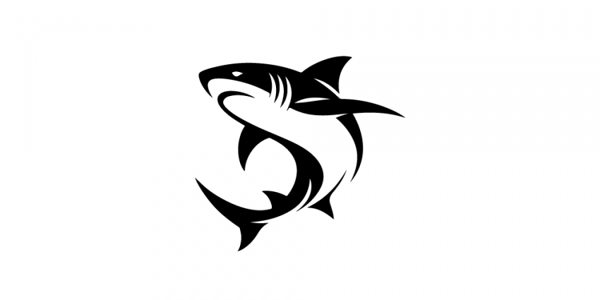
Transform your brand identity with a Modern and Elegant Black Shark Logo. A perfect blend of elegance and power for your business.
Fewitech logo Design
The logo creatively merges the letter ‘F’ with a WiFi symbol, symbolizing connectivity and forward-thinking technology. This modern design embodies innovation and digital communication, making it perfect for tech-focused brands.
Modern And Elegant White Mouse Logo

Logo design of Modern and Elegant White Mouse. Suitable for any industry.
Abstract And Elegant Woman With Hat Logo

Logo design of Abstract and Elegant Woman with Hat. Suitable for any industry.
Elevation

As one of the fastest growing energy companies in the United States, Elevation contacted us to rethink their Brand Strategy and Brand Design.
Having discovered and crystallized Elevation’s brand story, we were ready to go on to the next phase of the project: designing the new brand identity.
In the officially selected design, we highlighted the ‘revolutionary’ quality of the Elevation brand by creating a stylized flag symbol that also resembles the symmetrical layout of the solar panels. The upward movement suggested by the name ‘Elevation’ was incorporated, creating a seamless connection between the emblem and the brand name for enhanced perception.
Javista

Javista is a beloved coffee shop at the heart of Hollywood. With more than a decade of experience, the owners decided to transform their humble shop into a larger, more professional brand with two new locations and a whole new vision.
Javista’s existing design language were lacking some important aspects. They had multiple attempts toward better branding but there were problems in execution. As none of the designs completely reflected the brand personality, they kept using some of the old materials which created an inconsistent brand look and confusion in customers’ minds. The sign showed one logo, while the cup displayed a different one and the website included both in different ways. Multiple fonts were used with inconsistent sizes and spacings, and colors differed throughout all mediums.
Our goal was to come up with a fresh and modern yet timeless identity, that elevates the Javista brand, and prepares it for the new business plans and the future. While doing that, we would also pay homage to a couple of its earlier visual elements, which were the big ‘J’ and the crown as a mark of their promise on quality excellence. After a meticulous exploration which ended up as a 185-page design presentation loaded with creative ideas and mock-ups, the final identity was shaped and approved by the team.
Knox

We started our process with a series of interview sessions to determine how we should have positioned the KNOX brand. The client’s answers to our tailored brand questionnaire helped us come up with the right creative strategy. We compiled a list of keywords that represent KNOX’s mission and vision, and narrowed it down to create a distinctive and consistent brand personality.
Our final keywords were sophisticated, scientific, elegant, modern, clean and simple. The goal was to make the brand look sophisticated and elegant, while also highlighting its scientific excellence. With that in mind, we started the design process by creating a wordmark for KNOX that has a beautiful balance of serif and sans serif. It looks and feels luxurious, but also serious and professional enough.
Leafage Plants

The Leafage brand represents the elegance and sophistication of exotic plant culture, while refraining from creating a distant relationship with customers and plant enthusiasts. Its unique archetype enjoys the duality of ‘Sage’ and ‘Companion’. It guides you with knowledge, and walks with you as a sidekick, creating a genuine community by offering approachable wisdom.