
Most viewed logos · Page 97

Logo for Italian cafe for a cinema hall in bangalore.


Ready Made Logo https://eisaks.wordpress.com/2016/02/03/heartraeh/

Rebranding of Angels Toruń Football Team

Logo design for petrol station
The Ocean Palace Luxury Resort logo features a minimal black and white color palette to keep the focus on its intricate symbol, which bears a crown in the middle to imply luxury.

emailaa, beautiful newsletter designs


Top of the shelf design by Savael. This renewed logo has a better feel with his font, colors and kerning.

Ludlow Ventures
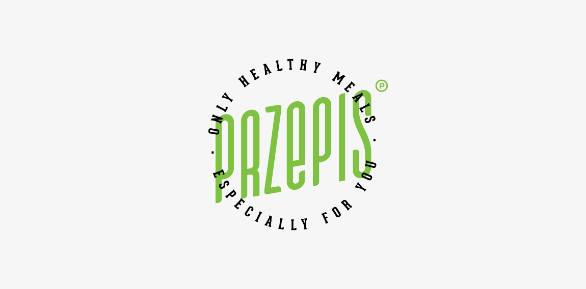
A hipster emblem designed for small company offers healthy meals with delivered to your workplace. "Przepis" means "recipe". • • • Made for Motyf Studio • • • follow us on www.instagram.com/triptic.pl

An idea which was not used.

***

this is a company logo design and interior architecture

Sunbreak Homes, LLC is real estate company. They buy homes that need work, fix them up to make them beautiful, then list them for sale. The name of Sunbreak Homes was chosen for a special reason. They are based in Seattle, WA, where it rains all the time. So, when the sun does decide to come out from behind the clouds, everybody gets excited. It's called a "sunbreak". The imagery I had in mind for the logo is to somehow incorporate the sun's rays breaking through the clouds, keeping it simple and memorable.

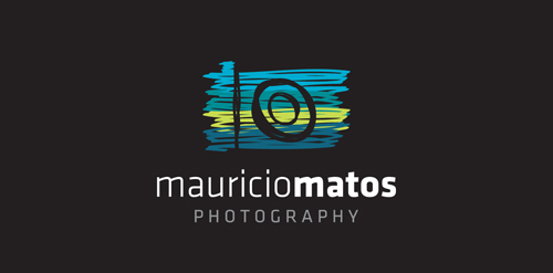
A new logo for a travel photographer.
Simple Abstract Logo Design

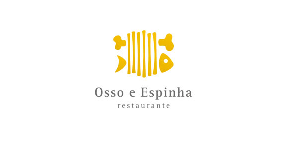
Osso e Espinha logo

logo concept for a creative agency
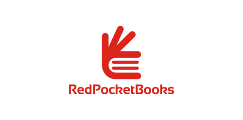
Amazing logo perfect for bookshop or education. It is for sale.