Most viewed logos – Page 495

Events Management


Logo for media agency

Logo for bodybuilder.sk.


Logo for real estate
Updated from very hastily done first draft, this will be the logo for my personal website. I'm open to suggestion and/or feedback. Took a cue from FedEx and Storm Foundry to incorporate arrow and tried to make it look a bit pixelated.

Identity design for X-Games 2002 / Philadelphia

Logo designed for a night club/entertainment venue.

Logo for new business that enables people to sell their homes privately online.
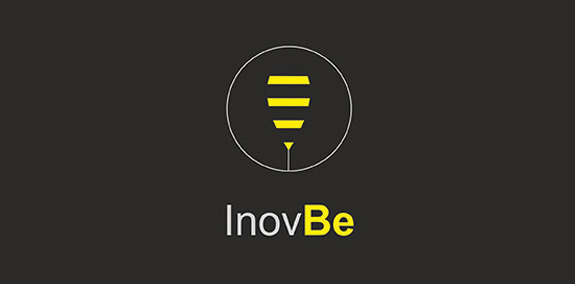
InovBe - computer security software
Logo for the event "Sofia Jazz Week"
Description: hocico means mouth. Hocico it´s an industrial band from México. The type represents fangs, so that way you should see a big mouth!

A light logo design

Bikers Hood

good logo whit higt and clean visual impact
Kim Xuan is a vietnamese stir fry sauce company in Southern California.

free work.
E-success is a company based in Athens, Greece that manages e-shops. The logo is friendly, eye-catching and connotes trust and high end technology. A vivid purple color was used to achieve memorability.

The logo depicts a tree in the form of the bird's nest, where the sitting bird. This represents the cosiness and harmony. The logo is suitable for different business areas.

Women's Spring Festival

I was asked to make a logo for a customer who is starting a company called iClick.