Most viewed logos – Page 474

A web applications development firm.


Sale and support of programs for businesses.
My initials as a logo. Are any of my attempts any good?
Logo for the person who makes masks from ceramics.
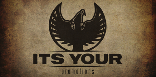
Logo design for It's Your Promotions music promotion company. They wanted to maintain a feel of punk and grunge while being somewhat corporate at the same time. The idea being that they wanted to represent their roots in the music while showing their legitimacy in the industry simultaneously. The phoenix rising with its dynamic wings also represents this feeling.

The logo is self-explanatory: Meal4u is designed as the webadress. A knife and fork stick out from the logo on the left, providing it with a recognisable shape. The colours green and orange support a modern appearance that appeals to a young target group.

Logo for Claughton Fire Protection


Logo para empreendimento imobiliário. Logo for real enterprise real state.
logo for software company

Logo for an organisation that raises charity funds and other amazing activities. The curls on top of the logo represent the arabic word for Victory 'El-Intisar'. I know the colours do not represent the feel and ambiance of the organisation, but this is what the customer eventually chose.
ShaunMarq is a person, a brand, a team taking fashion, media and design to the next level.

K R M
(Ivan Anderson) is the name of the owner and also the name of his business agency .

Hear-beat Logo in white.

Logo for Mighty Eighty Denim (jeans) for detail >> http://issuu.com/cheapmink/docs/mightyeighty

Vitamin supplements. Apple is incorporated as an abstract square to be more symbolic.
Logo for a new startup printing agency.

Logo for the Boston Thread & Print Company.

the name reflects sweet and good results in where you find cooperation among respectful stuff