Most viewed logos – Page 453
Octty Type


This logo has been designed for Unesco tribute 21 competition award.

The logo represent a mobile and speedy shark. This stylish fish suggest energy, flexibility and security. The green color make the shark more friendly and communicate trust. Great for mobile applications, technology and security services.

Logo for a financial internal web

logo with very simple concept where the "Q" is a balloon
dog training
Award-winning music production company
goldsteinmusic.com


Unused proposal for a gaming company that makes first-person shooter military games.

Sound System's Logo

Cupcake, Bakery Logo

Winner logo in contest on "freelancer"
LOGO PARA EMPRESA DE EVENTOS

For application developers
Logo for a social networking mobile Application.


This we took an old design and color theme... same font and turned it from 1990's to 2010's - Used the D and spun it... got a cool circular icon
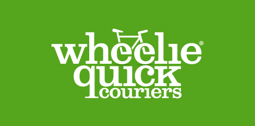
Brand Identity for a Manchester based cycle courier service. The client wanted a modern and simplistic logo that incorporated a cycling theme throughout. We created a bicycle icon from the double 'e' in the word wheelie and finished off the logo in a modern, bold font. We used the colour green throughout to highlight the eco-friendly element of the business.

This logo is for sale and could be applied to a variety of business models including: pet related products and services or out door cool climate active wear. Subtle use of negative space creates a picturesque mountain range while the emphasis remains on the proud active dog


Music info website
Logo para a Rádio da Prefeitura Municipal de São José do Rio Preto. Logo to the Radio of the City Hall of São José do Rio Preto

A logo proposal for a Wordpress theme development company.