Most viewed logos – Page 456
Logo design for medical software.


Shark Shipping services provides all kind of recognized products and services to the maritime industry. This includes safety products and services, chemicals, maritime logistics and ships agency. I've came up with idea of incorporating the two shark tail as shape of ship. If you rotate the left half of logo to -90 degree and other half to 90 degree audience will discover the hidden message of the logo.

Ebsar electronic project

Logo design for a commercial real estate company.

Logo for start up business.
Logo for a social networking mobile Application.

This logo was design – for a new business venture.

We are building an online travel experience and brand focused on socially responsible travel. We are teaming up with international experts, government agencies, nonprofits, small businesses and communities to revolutionize how people plan and experience their trips. We are young, hip and forward-thinking with our finger to the pulse of pop culture. "Vaya" is the command "go!" in Spanish. "Vayable" is pronounced like "viable," which means capable of living, growing and developing adequately. To connect people through travel for the sake of creating happier, more authentic and sustainable experiences for travelers and the communities they visit. honesty, ingenuity, authenticity, adventure, compassion, ambition, edgy, cooperation, optimism, efficiency, wisdom Using the negative space to combine two concept which are the Google pin and the concept of logo(Vayable). Take the trip, change the world.

Logo redesign concept for existing business.

Winner logo in contest on "freelancer" for mountain shoes sailer

eotfast.com helps you convert TTF fonts to EOT. The logo usages a cheetah to convey speed.

For application developers
Mondayist is fresh modern dynamic brand with short easy memorable name. It will suite well to any business or industry. Mondayist: Someone who believes that Monday is the first day of the week.
Logo for Performance Training Co. in MN. // Gallery: http://goo.gl/Q3TBR // gopt1.com
BORDEO is fresh modern dynamic brand with short easy memorable name. It will suite well to any business or industry.
Logo for Danamex Trade Ltd that is engaged in export and distribution of healty food products to Canada. Here I stylized the maple leaf (which is ofcourse the symbol of Canada), inside which are the two hands that are pointing in its direction, symbolically towards Canada itself.

Dance Marketing Group
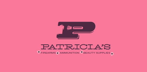
This logo for a completely fictitious company started when I noticed that the negative space with the letter P set in the typeface Blackoak looked a bit like a gun firing a bullet. This got me thinking of how interesting it would be if there were a super-girly, female-owned and operated boutique, catering only to women, which sells not only firearms and ammunition, but also beauty supplies. Everything a modern woman needs! Hey, if you're gonna make up a logo and a company to go with it, why not have a little fun with it? Here, the left side of the P reveals the profile of a gun barrel in negative space, while the negative space within the bowl of the P reveals a makeup brush, which doubles as a bullet being fired. The P mark, based on the Blackoak letterform, is constructed by hand, and the type for "Patricia's" is based on Archive Antique Extended, and is also constructed by hand. I did this because I wanted rounded corners and edges to give the logo a more feminine touch.
Click here to see the case study for this logo, which chronicles its development, and includes full design rationale, sketches, electronic roughs, and alternate designs.
Logo para sistema de energia e automação. Logo for energy system and automation.
Logo Design for a high-end residential contractor based in Colorado.
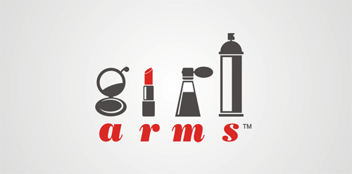
Logo for cosmetics store. Hidden word "girl" in logo!
Crochet Goods from Cape Town South Africa