Most viewed logos – Page 395


OmniQuest Living Logo

Re-branding of Sharptech Web and Creative services with new Logo and Name (Interactive Waves) option2

Event Management Logo

logo for travel web service
Doc's Pest Control provides exterminator services to the greater NYC area.

Distribuidor oficial Orange en Castellón, Islas Baleares, Alicante y Murcia.

Businesses have made a unique image in the minds of their clients and its players by its individuality; and this identity is well supported by its Custom logo design. The logo design of a business helps the company to get brand awareness in its respective market.

Logo for small electronic's retailer.

Logo for technology integration organization,

There is one small story behind the meaning of TRIONN DESIGN LOGO Trionn Design is A Design Studio. 15+ years of professional experience in Website design. We are working on HTML5, CSS3, jQuery, UX, UI, RESPONSIVE DESIGN.
Clinic of Psychology
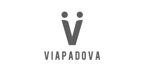
Once upon a time, the area known as Via Padova in Milan, Italy, had a less than salubrious reputation. Our project was to help change that image by creating a new identity for the area that would bring the various groups of people – or local tribes as we called them – together. We needed to represent Via Padova as a space that welcomed every one of its citizens – a challenging proposition. The city needed a visual system, a graphic identity that could organise and simplify communication with the people. We used the letter V to symbolise a handshake – and hence the union and coming together – of two people, symbolising a community coming together.
This time the client was really special. A beautiful girl came to us and told us that she would sell her used panties abroad, after the initial surprise we immediately started to think about how to represent in an elegant way a so "dirty" concept and here is this logo, similar to a fashion brand, it goes perfect with the mood of her photos and on her underwear clothes.


Podere principe della macchia, a new company of food products but most of all bee products.
The company in place at Santa Anastasia at the Feet of Mount Vesuvius where characteristic landscape of Naples, ancient and protected characterize the product in the selection and quality.
The brand wants to position itself predominantly in the range of products taste / quality and traditional products, the rediscovery of ancient flavors.
Objective.
the objective of the client was that of a logo that represents the company by projecting the old family coat of arms with its ancient values and traditions in our times.
I joined the old coat of arms of Caracciolo Rossi consists of a shield bendy gold and red to the head of blue.
This is the blazon that refers to the union of Charles bed (junior) that Gambacorta, Marquis of Celenza and Count of Macchia, in 1641 was awarded the title of Prince of Blur. He married Faustina Caracciolo, daughter of the Marquis of Brienza. Then I ran the whole thing in a modern and dynamic giving the shape of a shield that could drop drop indentificare precisely a drop of honey, and I worked on the various symbols of the coat of arms.