Most viewed logos – Page 338
Your new stylesheet


Logo para Virginia Aguado Photography

Logo for car repair shop. For various reasons company hasn't been established, and the project wasn't implemented.

Logo para produto de plano de saúde. Logo for health care product.


bulb n candle

Logo for eco camping and caravanning site in the UK. Lots of wildlife onsite. Client wanted owl as they are a frequent visitor.

Logo for a photography studio and Graphics Design

Sunny Wines is a small wine importer from Warsaw/Poland. The aim was to combine letters SW with wine symbols like grapes or cork screw, but the client wanted to see also more elegant symbol combining those letters.

Logo design done for a jewelry company


Strategija magazine portal about business and strategies.

Logo inspiration for the ancient indian medicinal & well being science...

Logo designed for a new company, an academic service provider.
Hekademia is an archaic Greek name for the land that contained a sacred grove of olive trees dedicated to Athena, goddess of wisdom. It is the place in which Plato built his school of philosophy. The logo needed to reflect this theme and include an olive or olive tree reference.

A logo design for luxury car.

Type


Logo para grupo musical.
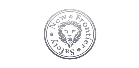
Logo design for a safety consultant company (New Frontier Safety LLC) the oil and gas industry. Specializing in Safety Leadership and Coaching, U.S.A.

Tomaszowska Okrąglica is a group containing 3 tourist attractions: blue sources, caves and museum located in Tomaszów Mazowiecki (Poland). Naming comes from characteristic, spiral way Pilica river is flowing. All the atractions are situated near the Pilica river edges.
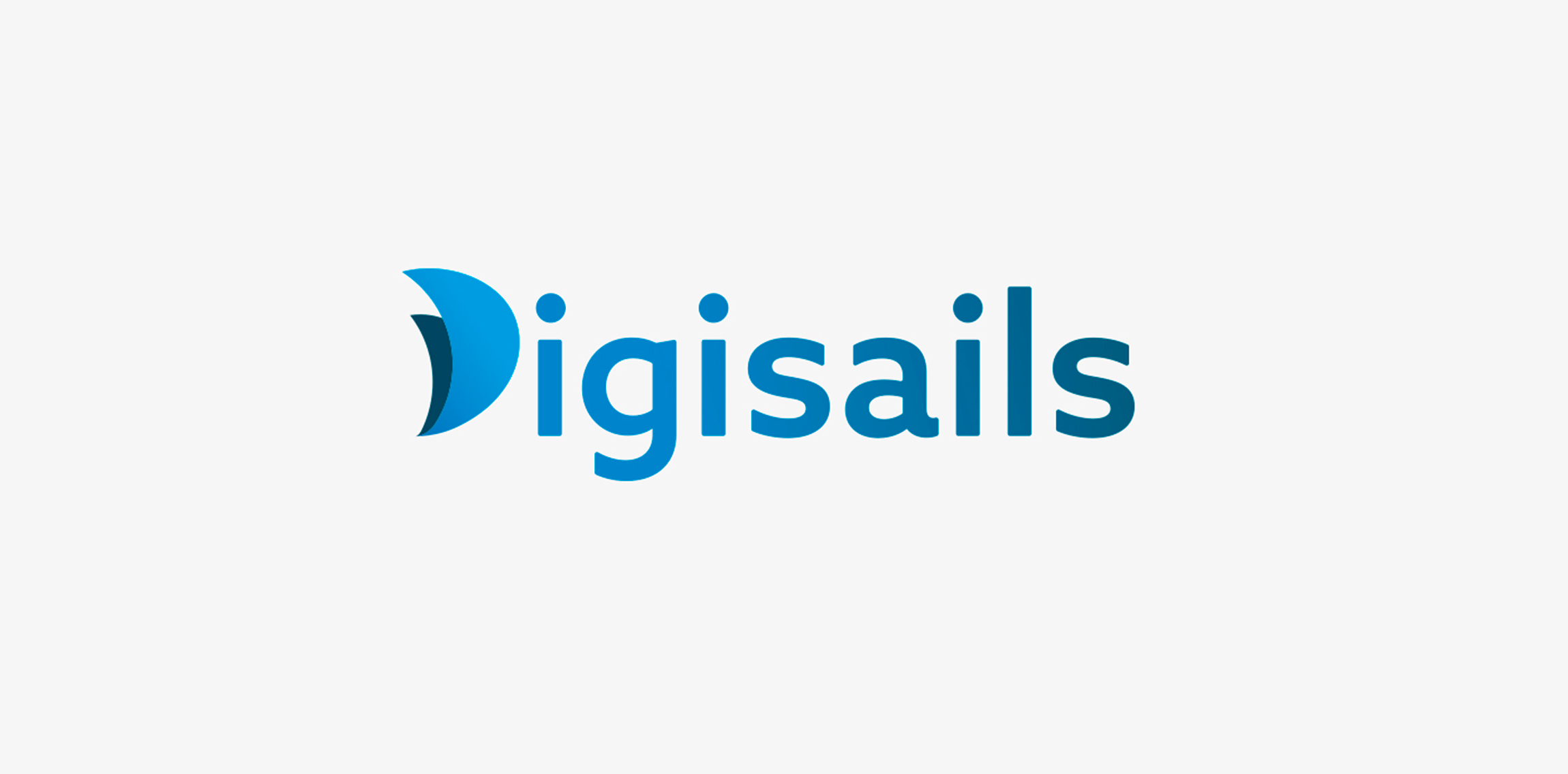
THE CLIENT Digisails is a brand new consulting company that focus on assisting businesses in the digitalization of their internal and external services. Digsails's aim is to shape companies’DNA and take them step by step on the road to success in the digital world. Digisails’s values: · Research · Innovation · Transformation · Involvement · Technology THE CONCEPT "Set sail in the digital world". Companies can’t ignore the ongoing digital revolution anymore. Sailing in this new era is not an effortless task, hence the nautical metaphor: Digisails is the best solution for proceeding along the right course and not get lost in the shifting of your own core. THE OBJECTIVE To instil these values in an up-to-date logotype, clear and tailored to each company’s needs. An increasingly web-oriented logo, nevertheless viable on printouts and unusual media, such as fabrics or other materials. THE SOLUTION The logo is a combination of symbols and typography. The initial, “D”, is represented by two sails swelled by the wind. This symbol will be repeated in the development of the entire identity system. Its colours reflect the blue sea, conveying, at once, a modern and technologic spirit.
