Most viewed logos – Page 311


Logo for Pitch communication & pr

Dutch investment partners for successful companies.
Pingwin means penguin.

Logo shows match,flames,heart and an infinity symbol.

Internet Service provider

"The Rabbit Hole" is an night club.

Combination of a battery and a suitcase.
Munnes logo In order to highlight the quality, style and distinctive character of the Munne glasses, we have developed a logo that reflects all of this. He chose a stylish combination of an icon and a name. Using graphic details, we have created a unique and exclusive design of the character - the letter "M". The square contains a hollow letter, which consists of various graphic details and shapes. This style looks like a non-banal, unobtrusive, and eye-catching one. To keep pace with classics and aesthetics, we selected a combination of two colors, a white-and-white. It helps maintain the image of a neat, modern logo. We branded the brand next to the symbol. We chose the color of this dark brown, color. The brighter and "heavier" name of the brand has become like a counterweight, a dimmer symbol, while preserving the integrity of the style.

Logo for the artist and designer Serge Bakalyna

Exclusive Customizable Logo at Eisaks Logo Design
Be aware! This guy is serious! THis one is for sale!

Logo for design company.


Restaurant / Club
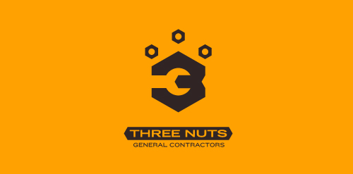
This logo is for a completely fictitious entity named Three Nuts General Contractors.
The idea for this brand came to me when I was out and about in the world, and saw a contractor's work van drive by. As I looked at the number 3 in the telephone number on the van, I started thinking about how a cleverly constructed 3 could reveal a wrench in negative space.
Using a hexagonal bolt nut as my main source of inspiration, I thought of a whimsical name which would support the concept I had in mind. In this hypothetical situation, the "Three Nuts" could be a team of three general contractors.
The icon is built from the angles of the bolt nut, and the entire mark should evoke a heavy industrial feel; something that could be stamped into metal, etched into wood, or simply affixed on the side of a work van.
Click here to see the case study for this logo, which chronicles its development, and includes full design rationale, sketches, electronic roughs, and alternate designs.


Work for a computer games shop. We created a new game character. Looks too simple? It consists of all the pixels necessary.
A logo for a German company


Baltic (Sea) Artistic Agency logo proposition