Most viewed logos – Page 31

cool icon with a swan and a diamond shape inside it for jewelry, handcraft oriented or not.


Simple design of a key.


A conceptual thought.. Waiting for the client :)

Recently made a revision of my old logo scetches and found that bear mark. Just wanted to share it with you guys.
Design Art Interactive

Logo made just for fun. A lighting innovation company brand.

Logo for mobile games creators

Logo created for a retro fashion website.
We are a design studio in Madrid, Spain. We realize branding projects, and online communication such as web pages. From concept that the most important, the essence, the secret ingredient the makes you unique and different and special is "invisible". We take care of every detail to achieve the result persists in time and memory of people from simplicity and funcionality.

ATH Sports Nutrition is a small company created by athletes to improve athletic peak performance. We use the latest research and technology to develop supplements designed for professional athletes that allow us to train harder and recover faster.

Conceptual logo design showing a medical Caduceus and technology symbols combination. For sale.


A sleeping cat that has made a nest with his tail portraying care, safeness and help. Just for fun.

Beautiful logo for SALE.
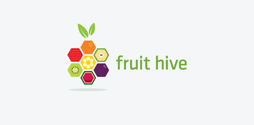
Logo concept for fruithive.com

Unused concept. Just for fun.

Unused proposal for a clothing brand.

Final logo for Offworld Games, a mobile sci-fi / fantasy games developer.


Stylized letters (curly ribbon) – M (mind), U (union) and two i (two persons), e.g. communication, psychology, transcendental areas, etc.
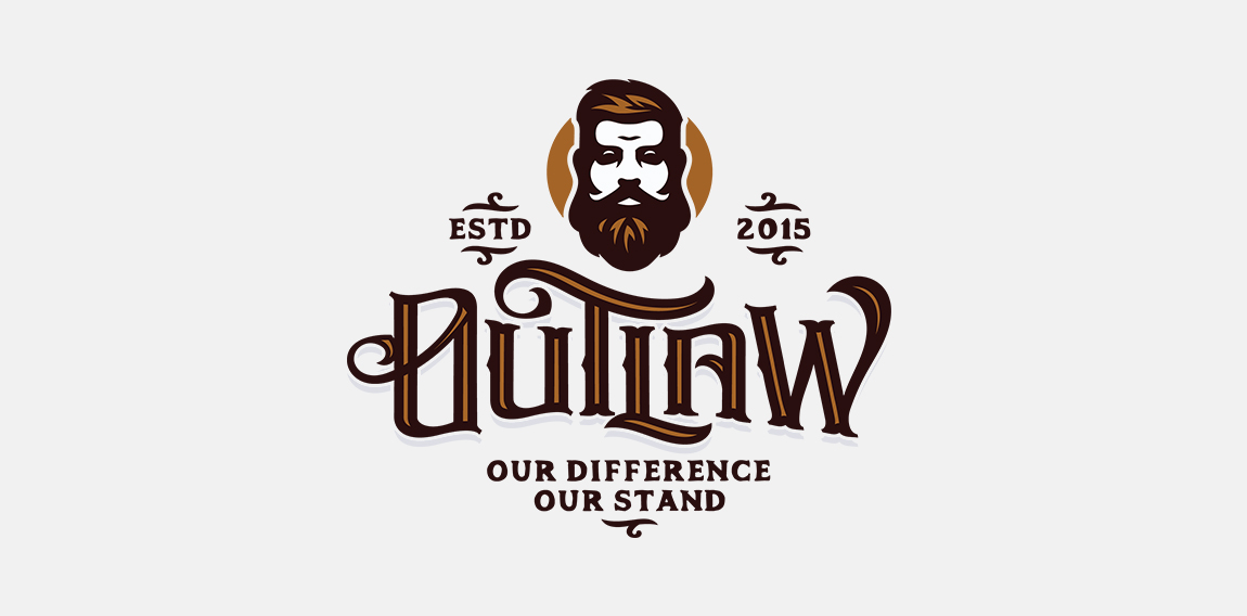
Logo for a new apparel company named Outlaw

Custom logo design I did in 2012.

design for a group of beer brewer's.