Most viewed logos – Page 246

For an Italian Restaurant (unused)


Just done for fun


Producer of timber houses.
The client wanted to emphasize quality, nature, beauty, uniqueness, trust and avoid references to traditional symbols (roofs, doors, windows, buildings) used within this industry.
Gobro Con is a Toronto-based construction company.

Accuras is an engineering/pre-fabrication company, specialising in steel sheeting & roofing solutions. Blue & yellow represent Accuras' product durability over of conditions of extreme heat & cold.

UK Student TV Channel that broadcasts nationwide

Unused idea for a travel agency
In the designer's words: Lettering full-bodied for a combination of letters used in amazement. To design agencies, graphic design, web design and media who want to impress clients with their products. A young agency that is placed on the market with a spirit of innovation. The lettering is also a perfect ambigram / Ideal for these industries: Entertainment & Media, Art & Photography, Design & Creative Services.


Skin Suite - skin clinic making skin looks younger


NOA – glam / electronic music club.

project management

unused proposal for Gully clothing.

"Dos Tios Serios" in english means "Two Serious Guys". This logo was designed for an agency created by two youngs enterpreneurs. The logo has 2 views: on one hand we can see a man with moustache, that symbolized the serious part of the agency, on the other hand we can see two guys holding hands, that symbolized the creative and funny part of the agency.
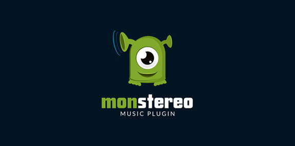
Logo for music plugin MONSTEREO

Global Cyber Alliance ("GCA") is an international, cross-sector effort designed to confront, address, and prevent malicious cyber activity. While most efforts at addressing cyber risk have been industry, sector, or geographically specific, Global Cyber Alliance is unique as it partners across borders and sectors.
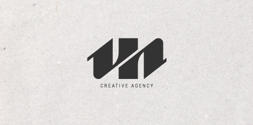
Logo for creative agency.

A logo for a kids corner in mall located in Hurghada, Egypt.
