Most viewed logos – Page 237

Trade cinema company


Animal Logo Design

Animal logo in the shape of a seal in conjunction with five stars with brown and blue colors. Logo for sale : https://inovalius.com/item/seal

Logotype made for little printhouse from UK. The heart refers to the passion with which they indulge in their work; folded element ambiguosly refers to paper.
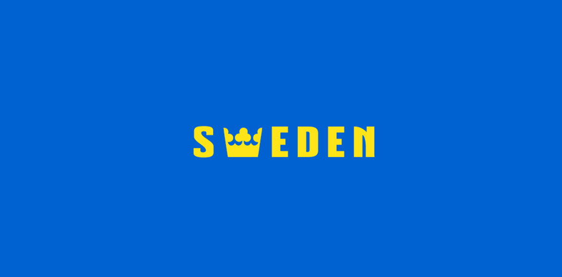
Country names , logotypes

Exploration of calligraphy. Custom lettered Cocobolo.


Café lounge Panorama, Located at Ha Noi, Vietnam

Gelatobar Kokozi

El Tempo | Teens' footwear brand
Incorporated my initials (Daniel Janev) starting "d" from the top, looping to the "j" actually the same form in the end. Little bit in retro grunge style.
Logo for tech company (software applications design & development)
Logo for mobile apps develop company. More on: www.onedot.pl

Hotel


fun logo

This is a logo for grils shoe.girls just like kitty.^.^

BE monogram proposal for event planning business.

Made just for fun :)
http://belgianfries.in/ FIRST OF ALL WE WANT TO GET ONE THING STRAIGHT. WE ARE BELGIAN FRIES. NOT FRENCH. NOW YOU MAY SAY WHAT DIFFERENCE DOES IT MAKE? WELL THE DIFFERENCE IS THAT WE ARE THE REAL DEAL. FRENCH FRIES ARE USUALLY MADE OUT OF PULP AND EXTRACTS; WHEREAS, THE BELGIAN FRIES COME FROM REAL FRESH CUT JUICY POTATOES, RICH IN VITAMINS. ALSO, FYI; FRENCH NEVER REALLY INVENTED FRIES. IT WAS JUST A LINGUISTIC MISUNDERSTANDING. IN OLD ENGLISH ‘TO FRENCH’ MEANT ‘CUT INTO STICKS’. TO ADD TO IT, DURING THE FIRST WORLD WAR THE FOLKS IN BELGIUM WHO SOLD THESE DELICIOUS SOUL QUENCHING MAYO DIPPED CONES OF PARADISE TO THE SOLDIERS SPOKE FRENCH, SO VOILA, THE WHOLE WORLD JUST ASSUMED IT CAME FROM FRANCE! SO THERE, WE ARE PROUD TO SAY WE ARE BELGIAN. TRADITIONALLY, WE BELONG TO THE COUNTRY THAT BRINGS YOU THE BEST CARTOONS, CHOCOLATES, WAFFLES, BEERS AND FRIES. IN SHORT, WE PROUDLY STAND FOR ALL THINGS FUN!

Music Label The harmony of the simple shapes used, the color chosen, makes clear and direct the concept behind the brand: the union of the sun, represented by a flame, more, the empty spaces game of the treble clef.

Modern and simple logo for SEO Company

A mark for a sports supplement supplier called 'Stackz.' The concept was to create the letter 'S' from stacked elements.