Most viewed logos – Page 233


Branding identity for Risorgimento di Milano

defense & security systems

FEXOM is fresh modern dynamic brand with short easy memorable name. It will suite well to any business or industry.
Landscaping & Gardening
Dumma Branding is the design house of Duminda Perera. Duminda is currently involved in an ongoing logo project for design every day one Original, Clever, Wordmark/Verbicons or Negative logo.

Logo for the celebration of the 50th Anniversary of La Curacao, the biggest appliances and electronics store in the Nicaragua.

It's a logo for a japanese manga club.

Logo design for brand CUONGARDEN

artefakt

From a Collection of Ready Made Logos by Ingus Eisaks.


Brand of paper toilet seat for one use only.
Designer: Denis Aristov Client: Sweden Group Industry: Advertising Agency Keywords: advertising agency, square, cube, apple, orange, green

This is a logo for a company called Arkuda that the old Russian means "bear."
Just for fun.
Human resources company.
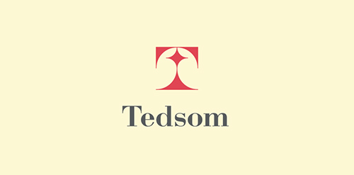
Half-symbolic, half-typographic concept. I have started with a concept of a road leading ahead, with a guiding star above, showing the way. Then, I had to add top serifs to get the letter "T", and with a little stretch of imagination it could be interpreted (or rather the negative space it creates) as the night-sky`s sphere.
I am pretty happy with the shape I have ended up with. It is purely geometric, simple, elegant, unique and strong. Of course it is also the initial of the company name, and the hidden message can be viewed as added value.
keywords: "T", professional, trustworthy, solid, experienced, elegant, simple, guidance
Sandwich Restaurant

Chiron Health provides a secure platform for physicians to connect with patients via video conference for certain types of follow-up appointments.
The linework creates a medical cross sign and a hint to video where the lines connect with each other in the middle.
