Most viewed logos – Page 206


logotype for cafe. I know he is too kind Capone but it's not for weapone store )

Nugno is a company that was formed when two compatible and creative individuals – Luca & El – came together. Grafting in collaboration, the pair multiply the excellence of their work, producing result- and experience-driven work. Their mission was to design an identity to define a distinct brand style that communicated the core values at the heart of the business – passion and creative brilliance. The final design combined a minimal typographic aesthetic and simple colour palette to create a distinctive visual identity communicating the purity of their style.

Blue Sea Studios logo I designed for the contest />

Be careful, this is atomic cat! It is for sale.

Oсновным фирменным цветом является коричневый цвет, близкий к шоколадному. Ключевые значения и символика коричневого цвета – «мать-Земля, дающая жизнь всему живому», «надежность», «трудолюбие», «преданность». Основа логотипа – это образ дерева, которое дает потребителям чувства уверенности, устойчивости, силы, вечности. Объединение коричневого и бежевого цветов воспринимается потребителями как энергетически сильное, поддерживающее чувство «уверенность в завтрашнем дне». Дополнительный серый (платиновый) цвет добавляет образу бренда такие черты, как «сдержанная роскошь» и «прагматизм».


Big Slice is a wood fired pizza place with a traditional brick oven. The custom-made hand lettering is a tribute to old style american lettering for restaurants.

I decided to challenge myself to create logotypes everyday with random words.

Logo design for professional wedding photography company capturing creative wedding photos.

Logo for a construction company from Sweden.

A draft for an upcoming non-profit

The logo idea for a company, which deals with business tourism in China, providing logistics services, assistance in finding suppliers and cargo declaration.

'a' and 'e' forming as a circular ambigram or monogram. On the center of the ambigram we can see a 'S' which represents my real name 'Shylesh'.

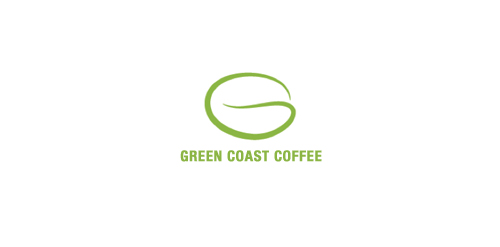
A coffee company - Green Coast Coffee - which locate in China. Simple: using a letter of "G" to be the main concept and let the coffee bean behind.
School Logo

Logo proposal

Logo for courier service