Highest rated logos
Most rated logos – Page 374
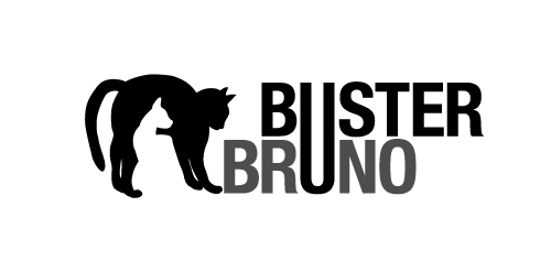
This is a personal project to create a positive/negative identity for a typographic illustrative children’s book called Buster Bruno.
Simple use of the distinctive profiles of Buster and Bruno my two cats uses the negative/positive space to created logo mark. The linking of the u from both words unites the two cats as they are brothers.


Official retro styled logo redesigned for Ianiverse Designs.


an establishment providing women amn men with services to improve their beauty, such as hairdressing, manicuring, facial treatment, and massage
Logo and branding for fingAIR airlines, which I use to travel by finger across the map.

Logo for outdoor apparell and equipment stores. full project here: http://leonczuk.com

The "Ready for Spain" aims to provide services to anyone who is thinking of traveling to Spain.

Certified Translation Agency

In development for Uberri, a new children's clothing label based in Australia. Target market is 5-12yr old girls, largest output is summer, beach wear & related accessories. The name Uberri, integrates with the tagline; Uberri (You are very) fashion concious, it also compares fruit to children - always growing, bright, full of life, etc.
Ship nhanh is mean fast shipping. Small business locate in Viet Nam
www.mikemark.com
Logo for a cafe that serves sweets!

Logo for a home decor business. The mark represent's the companies initials CQ and the sun, sea and scenery of the Caribbean.

Simple idea

Some working concepts for my studio logo redesign.

TRAK Foundation is a non profit organization comprised of members who raise money for children's charities through athletic and social events.

ROYALIX is fresh modern dynamic brand with short easy memorable name. It will suite well to any business or industry.

A unique logo for your unique brand.

WILFREDON is fresh modern dynamic brand with short easy memorable name. It will suite well to any business or industry
Innovations IT is small business, headquartered in Canada. They are professional working with best solution in Information Technology for hi tech products such as laptop, desktop and mobile phone.

Developed for a speech therapist & vocal coach based in UAE, I have developed both a Latin & Arabic typographic solution (see variations). Concept here is 'fun with pitch' - the green swirl represents travelling soundwaves, the yellow bar represents the golden note (or perfect pitch) with the blue bars representing the plus/minus discrepancy, so it’s about precision. There is also an implied smiley face, can you see it?
competitive work
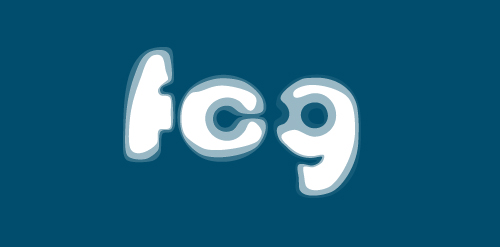
Fórum Cultural de Gulpilhares (FCG) A space dedicated to culture but mainly to music teaching. The logo was inspired by the propagation of the sound, the famous Font Bauhaus and no less famous music group.
Logo for photography company.
Web design company based in Dublin, Ireland.

logo designed for pizelato immagine corporativa's anniversary.