Highest rated logos
Most rated logos – Page 364

Internet Service provider


Logo for the 30th anniversary of the Asamblea Nacional de Nicaragua.

exceptional


Online Counseling , e-therapy, internet counseling, e-counseling, tele-medicine, or video counseling but we think online counseling is the best way to describe it. It’s simply having a counseling session via the internet with a web cam and it’s simple, easy and effective.
A propsal for an Iranian game review website. #unused
Acid Animation: creating movies
A logo created for a company called 'Think' they are experts in communications for PR, corporate communication and content creation

brand for Event Organization & Music Production

Planteamos un concepto en base al conjunto de servicios que brinda “JOLUSAGUI Home Decor” en el interior de una vivienda. Las líneas abstractas, curvas y rectas que representan la calidez y la armonía de un hogar, modificamos las líneas para generar un estilo minimalista y a la vez funcional.

El concepto sobre la base del símbolo “infinito”, genera la idea que no habrá más límites para viajar en bicicleta. Este símbolo se fusionó con la silueta de una bicicleta, creando un logo que se asocia fácilmente con su funcionalidad.

K for KERTAS. Paper origamis.
Logo for the gardens association - SOD RAFALOWKA

fishair logo/mark

Logo for property investment company - specialising in holiday homes and rentals.
Logo for mobile apps develop company. More on: www.onedot.pl
Custom logo design I did for Otricom in 2012.
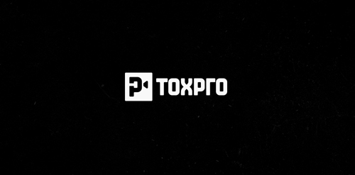
Logo for TOXPRO - production company. Logo idea: monogram letter T+P (Negative space) + camera symbol. Custom typography inspired Azbuka Alphabet. Founders come from Russia, would like to have in the logo russian element.
An architectural company in Turkey.
This logo is for a branding and web design company. Pixels and code are the building blocks of digital designs. There are four main elements within the logo: a wireframe of building blocks, the angled brackets > and < used in HTML code, as well as the letters “C” and “P” as represented by “>” and “<” respectively. The logo is versatile and can be applied in a number of ways: reversed out on solid backgrounds or on gradients, with a solid fill or gradient fill on white backgrounds.
Aggressive style JMG for this Motorsports brand
Top of the "J" and simple graph of "growth" represented in the mark
Consulting company (consulting, law, finance). www.onedot.pl www.youradvisors.pl

Grill × Bar × Boutique

ADMIRON is fresh modern dynamic logo with short easy memorable name. It will suite well to any business or industry.