Highest rated logos
Most rated logos – Page 307
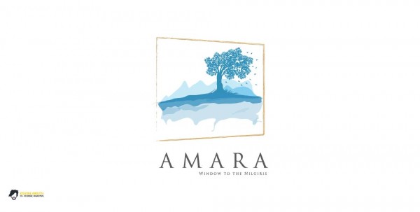
A logo for a colony building at Nilgiris, India.


paR
The city of Torcy, France recently built a great complex dedicated to the promotion of Culture & Arts, highlighting local and national artists. I was contacted to work on its complete Brand Identity, including Naming, Logotype, visual identity, Print communication, exterior & interior signage, website design and clothing.
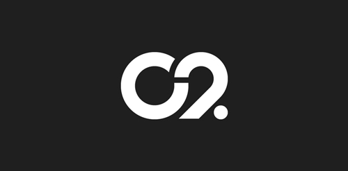
The main goal was to create a total new and innovative identity. Naming took a great part in that sense. I focused on trying to create a simple yet effective name for that building. C2 was chosen from a couple of hundred names for its international recognition, pronunciation and readibility. It stands simply for Cultural Center or the two initials 2xC -> C2.
As far as the logo is concerned, it followed in a logical way the naming process. A will to create a modern and contemporary logotype, yet efficient, minimal, powerful and durable. It was created so it could nicely fit and be readable at a great or tiny size on any document. The logotype guidelines show a slight dipping of the « C » and the « . » to create the optical illusion that all characters are aligned on the same baseline.

Ambigram 180º

Schron Sztuki (polish: Art Shelter) Student's Art Exhibition
This logo is for a corporate oriented website, named Alice Inc.
This logo is for a ad website, named Amadine Media
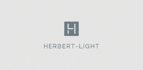
HL monogram for Interior stylist and designer.

Proposal for a website that features 'dress up' games for girls.

Logo for the Palestinian Chamber of Commerce and Industry - Ramallah, Palestine (Government Facility)

Grot Night Club

provides services in management and business development
Rocket that forms into AM initials

Landscape architect logo / 2009 / 2 (rejected)

Logo design Project

Logo for coffee house.

The symbol depicts continues movement, projecting progressive dynamism. The colour red brings out the passion and energy of the group while blue symbolizes stability and strength The three cogs on the logo signify the values of Integrity, Imagination and Individual

KELOWNA

The arrow portrays Avanse as a tool that breaks through barriers through education.

Truck sharing platform logo.
Economy and management faculty
Logo for a Television Agency (+pr)

Pendo started as a webdevelopment company trying to be of big value to its customers. Pendo is Latin for 'value', the meaing behind the name is that the idea of the client together with our solution creates a better/stronger result (more valueable).
Because we started as webdevelopment company the logo exists of two brackets < and >, these two combined create a stronger (more valueable) link.
The color is not final yet, I'm thinking of using a slightly darker and more blueish color in the final version.
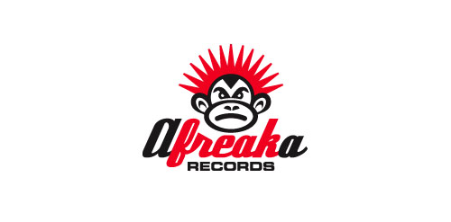
Logo for Afreaka Records, a record label for Afro-Latin-Electro House music.