Highest rated logos
Most rated logos – Page 267
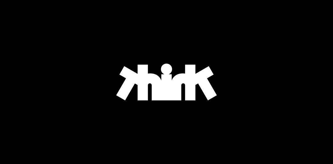
Ambigram


Logo for energy drink.


Online store - dogs clothing & accessories
Logo design for an printing company, Hungary

Logo design for an personal and property protection company, Hungary.

Logo design for a music producer based in Brazil.

Logo for apartment rental web service
*

Skin Suite - skin clinic making skin looks younger

Imkerei Wojciechowski is an apiary from Austria. This contemporary geometric linear logo for an apiary reinterprets in a fresh way symbols common in the apiculture trade. The image of a bee emerges out of intersecting hexagons of a honeycomb. It creates a layout, whose aesthetic strength lies in the logic of construction. The logomark is complemented by the brand name written using an original angular typeface.

logo for a cake shop company based in mexico.

A logo designed for a beer community.

A Montreal based design studio // A mountain on the moon.

Icon for Elle & Elle A Health Spa for women.

Wood&Floors.com

Sound architect logo

Mail King

A movie editing concept logo that feature a scissor and a hint of movie film.

Human + target + arrow logo concept.

logo for a construction and real estate company based in mexico.

logo for an art gallery based in mexico.
The Radford’s are the largest family in the UK and Hotfoot worked with them on their original website www.theradfordfamily.co.uk, as well as design and developing their brand new eCommerce website which was launched in 2015. The website was recently shown on the Channel 4 documentary 18 Kids and Counting. Charlie Haywood, Hotfoot Design’s Creative Director, said, “We were approached by Noel and the family to create an eCommerce site that would convey their commitment to good, wholesome food made from ingredients from local suppliers. As ordering a pie online is still quite novel, it was important that we designed a brilliant user experience that gave people the confidence their tasty pies would be delivered with extra care. After ordering one myself the other day, which arrived in a temperature controlled box, and which was, frankly, outrageously delicious, I am sure there will be many repeat customers!”
Unused logo proposal for photographer shooting mostly in gardens, parks, meadows, woods,...
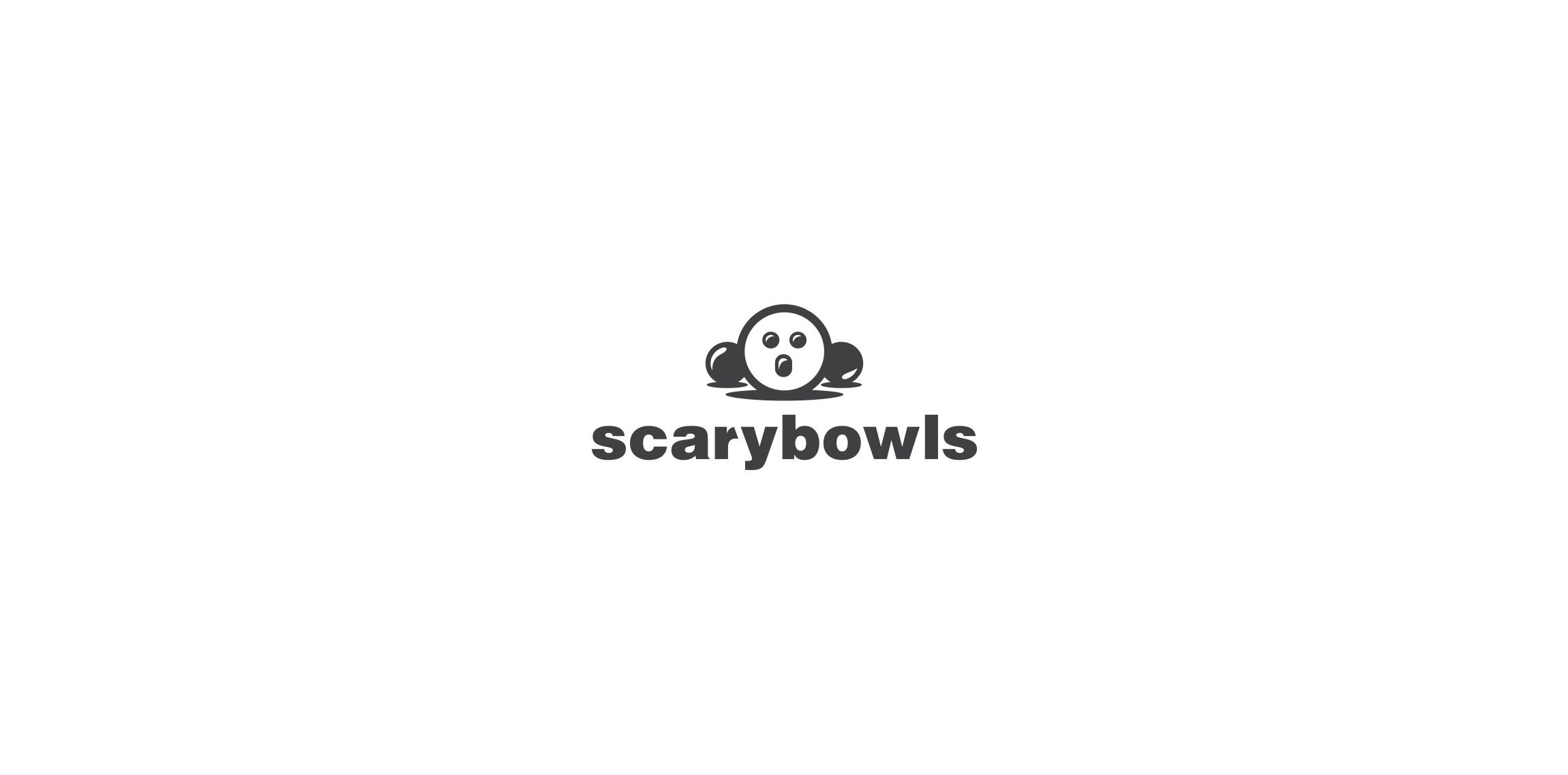
Bowling club logo.